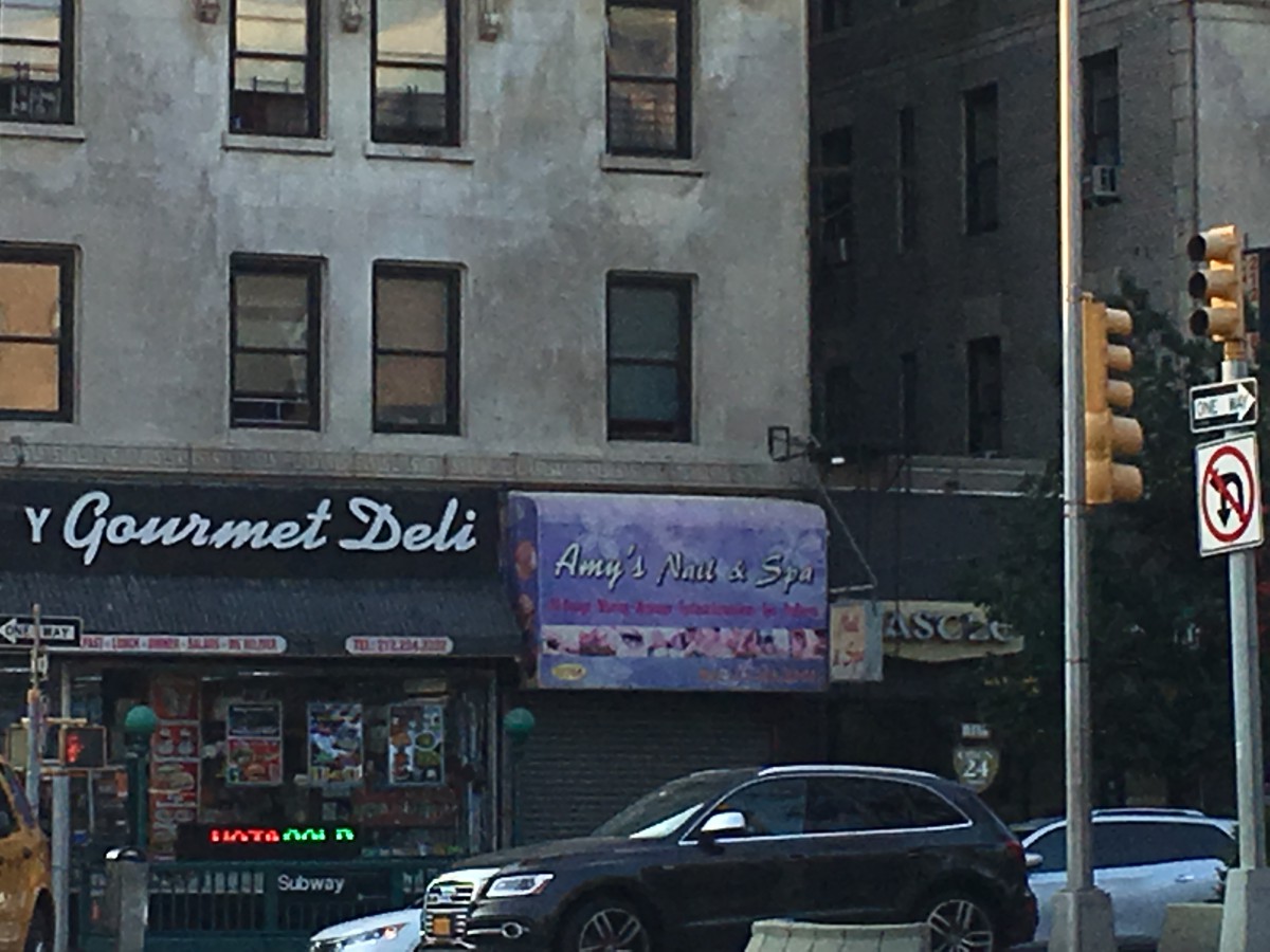


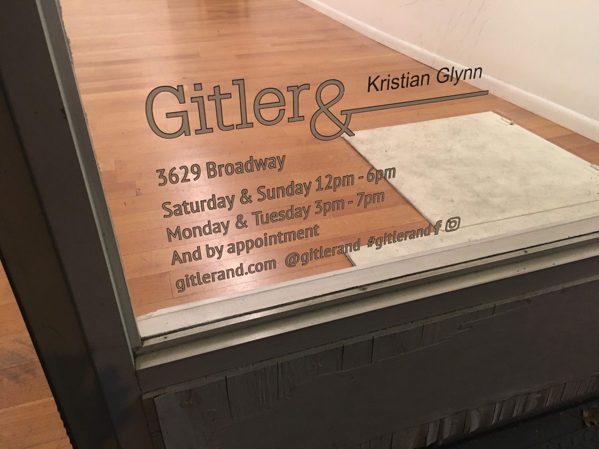
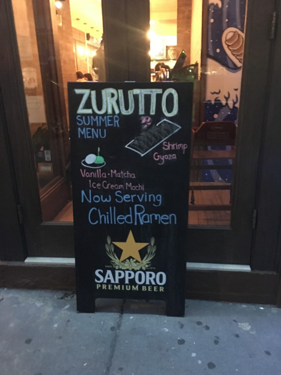
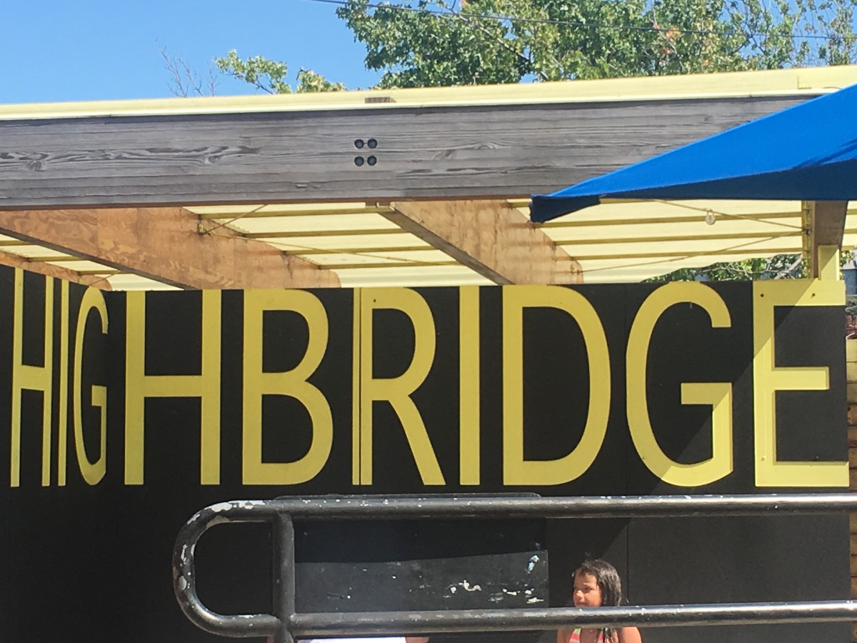


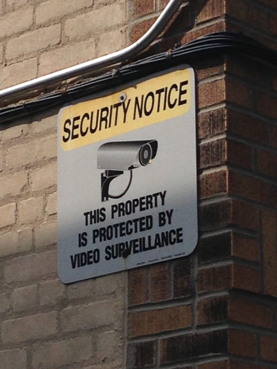
In this week’s COMD 1167 assignment, I needed to showcase examples of typography in my community through pictures taken in my neighborhood; Washington Heights.
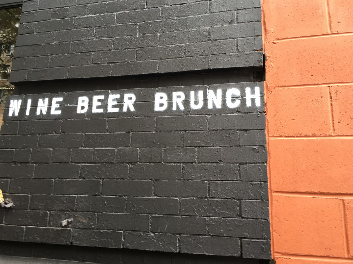
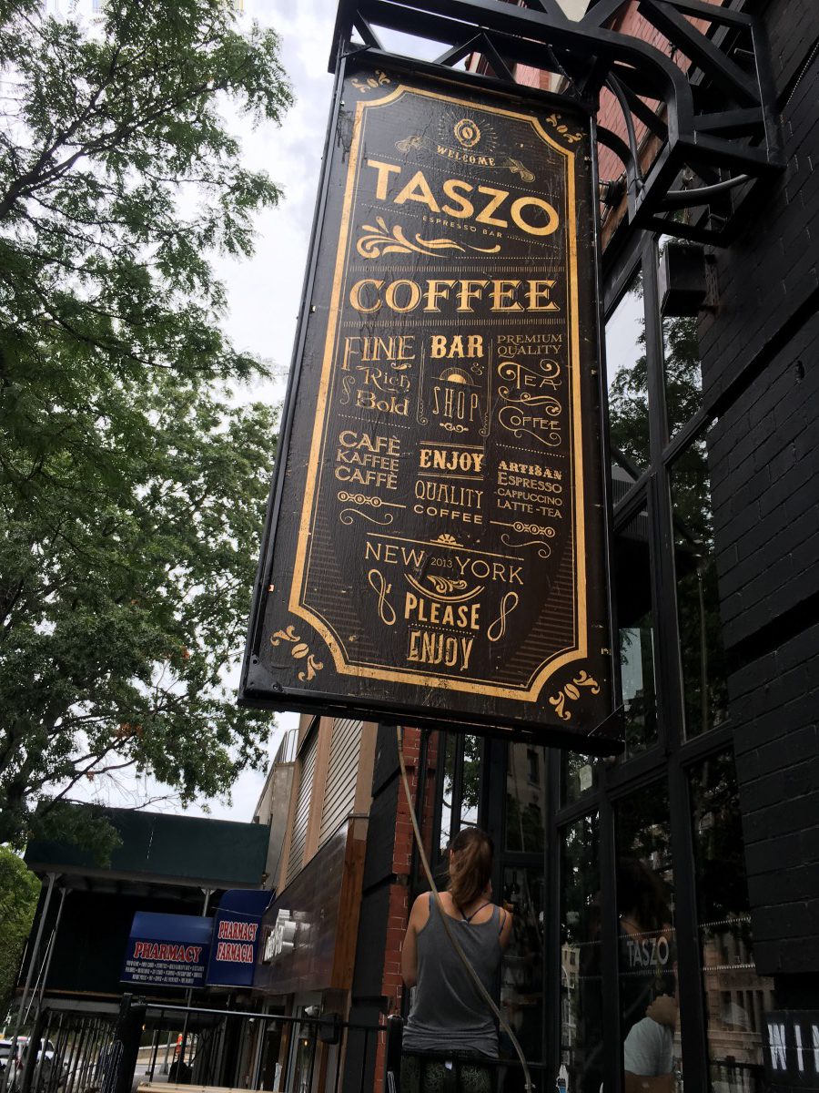
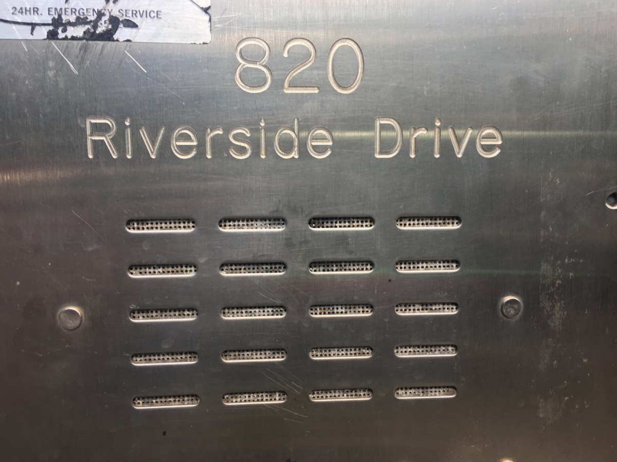
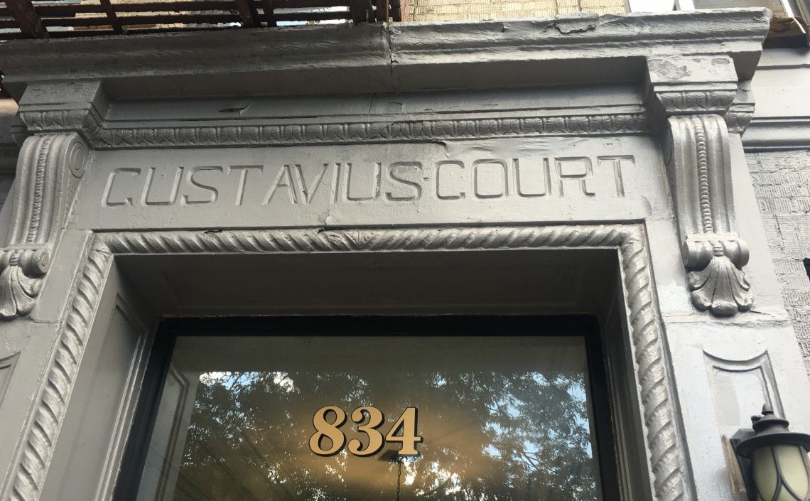
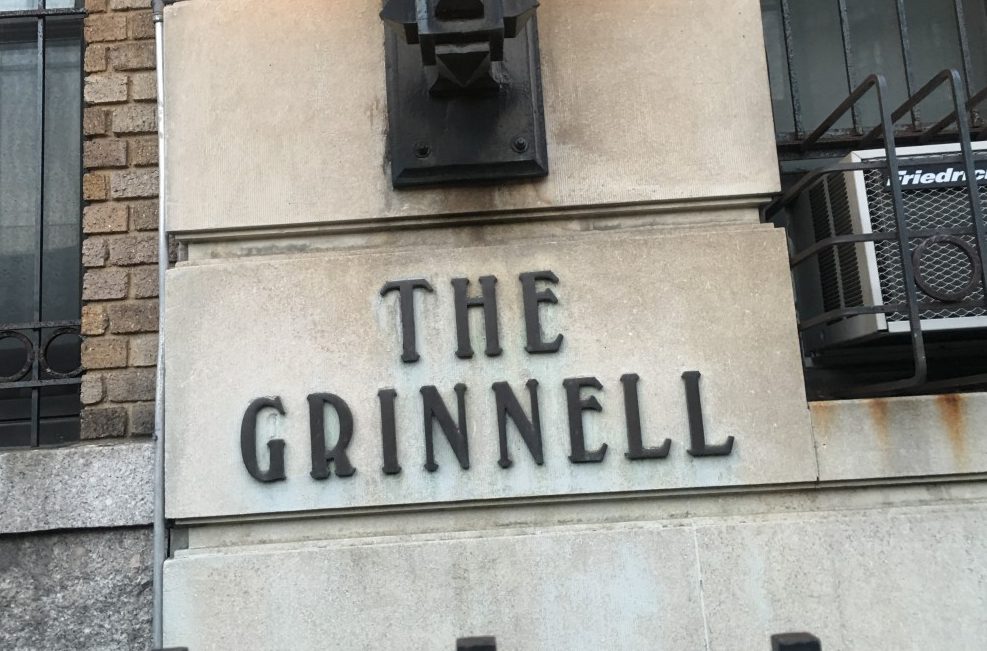
While exploring my neighborhood I noticed that most of the typefaces being used on store signs are san-serifs; I imagine this is done in order to make the signs easier to read and since people probably read it in passing. But some store fronts usually have a more stylized typefaces, mostly accompanied by an italic font. Some of the old buildings have what looks like modern or transitional type faces. Which I guess are more inline with the style of the building and the time in which they were built (circa 1900’s).
What I take away from the typeface research I have done in my neighborhood, is that it seems like a diverse environment. As well as, the realization that my knowledge in the realm of typography is very limited at this point. I hope that, by the end of this course I will be understand and interpret the reasoning as well as the intended impact behind typeface choices.


I think that’s a great observation that some of the older signage are part of the actual architecture of the building from their original construction in the 1900’s. I have a similar revelation in my neighborhood for some of the epigraphs I have noticed lately, that they reside on buildings that were originally crafted closer to 1900-1920’s.