
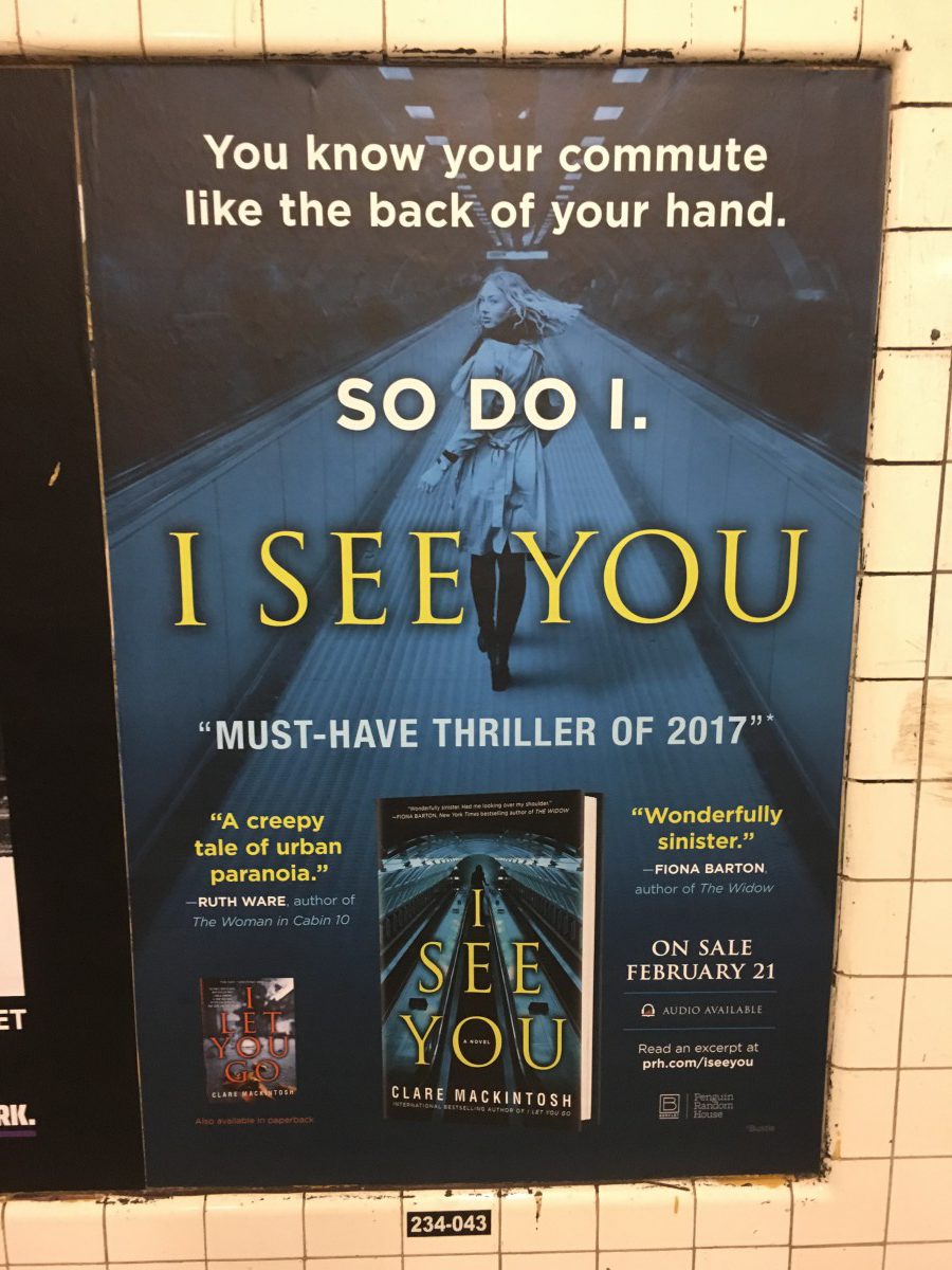
 This is a poor example of advertising because “I SEE YOU” is the name of the book but its really weirdly placed on the add. Followed by “SO DO I.” In a different font because its not the title but you don’t really until you done reading the whole top section of the ad. You really have no idea what its about and its not very gripping at all.
 I like this add because its title is hudge and is placed right under he’s feet. The image properly corresponds to the title in a goofy way because the couch is in the middle of the street, so you know its going to be a comedy. The the other import information is just as bold and big right under neath the title. Simple and direct!
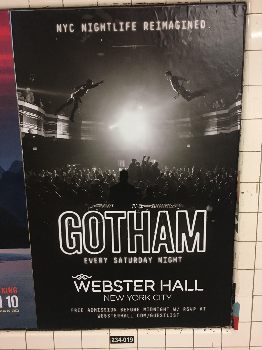 I love this add because not only do i often go to webster hall it has a really cool feeling to it. “GOTHAM” in big bold outlined letters looks really epic with the back ground being a massive image in black and white that seems very interesting. Following webster hall as the location in its own type of font. It slogan and entirety of the ad makes you really want to find out more.

