This assignment was to present an example of kerning a selected typeface to my best ability for optimum optical volume.
Specs:
Typeface–Open Sans
Font: Medium
Size: 50 point
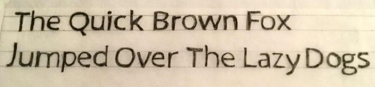
Above: Photo Versions Below: Scanned Version

Discussion:
[Note: The lettering is a little uneven due to a shoulder injury affecting my writing]
Determining the space between the words (tracking) was more difficult, so I did that first. Then I checked the look of the letters by squinting and turning the page upside down. The ‘w’ and ‘n’ of Brown was difficult to determine, as was the “Th” in the. My judgment of kerning changed in determining the balance of space. In the first attempt, the words were too far apart in the first line, and too close in the second. I had to picture where everything should be, and then judge a couple letters at a time as I drew. For my thinking, I looked to learn by expertise in reviewing all the class documents on kerning and understanding the purpose and art of it. I looked to see how much leading should be between type of this size (approx. 1.5 size of type), and what the classic ideals of space are.
Below: Parts of Anatomy, Labeled
[Click on image for clearer version]


Alex,
Lovely work and your writing is fantastic, helping me understand why the letters are a bit slanted or not resting on the capline (“Th”).
I agree with Juan, the “Lazy Dog” could use more space, as well as the “jumped over.”
The leading looks great and comfortable.
I don’t know if you need to repeat anatomy terms though, because it does turn out a bit busy, but it appears it worked as a good study guide for you since you did great on the anatomy portion of your quiz!
Over all your letters were pretty good!
Open Sans makes it tricky because of the defenders and tails but all were great.
Your anatomy detailing was good.
Need a tiny more spacing between the words “lazy & dog”
Careful with your letters and make sure you don’t change the fonts by slightest movements. (i.e. E on jumped)
synchronize letters so they look even on x-Height.
Nice job!