
Examples of the Five Basic Styles of Typeface
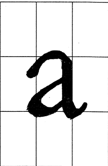
An “a” in Old Style Garamond
Old Style Garamond
“a” Working on the letters reminds me of Plato’s forms. It is a Zen exercise in feeling the flow of the letters. The grid helps enormously, like training wheels. The grid helps to anticipate what needs to happen. Intense working with curves, feeling like the curves reflect bodies of water.
Transitional Baskerville
“g” Smaller serifs—leads to more focus on line and thickness. Smaller serifs require finer detail. Transposing to a larger size is more difficult.
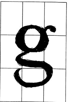
A “g” in Traditional Baskerville type
Modern Bodoni
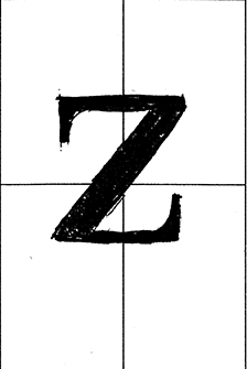
A “z” in Modern Bodoni type
“z” The letters seem broader and thinner. Tighter and more closed, some more square in brackets.
Egyptian or Slab Serif Clarendon Light
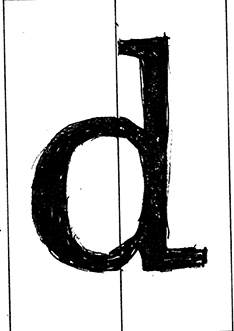
A “d” in Egyptian Serif Clarendon
“d” The lines are close to uniform. The font feels bigger to draw, the details of the line smoothness stands out.
Sans Serif Helvetica
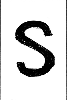
A “s” in Sans Serif Helvetica type
“s” Because of the near uniformity in line thickness, need to have more comfort with space and sense of evenness. An IKEA of fonts.

