I know today is Monday October 25th, so if I am not mistaken it’s week 8.
Our meeting began at 9:50 instead of 9 am. Isana was in a meeting with the Provost and other colleagues. When our meeting started it went very quickly. Isana was not feeling well and had a lot to do. One of the interns and myself have availability on Friday so we were told this week we would be on call.
The instructions for today were a continuation of the (BC) Brooklyn College Fact Sheet. Independently we had to create a list of what we had already updated and what still needed to be done. Based on the excel sheet provided last week I thought we had 8 things to update.
Three interns originally started working on The Assessment Review. Today myself and one other intern had our dark blue background flyer’s selected. We were instructed to use that design and include:
- White CUNY logo
- Make the header “The Assessment Review” stand out more (black bar opacity + white text)
- Try white opacity rectangle on entire flyer image
Before the meeting ended we were told there might get a new image for the flyer and that Dr. Sultana still needs to give her stamp of approval. After the meeting I ended up creating two additional examples besides the white copy on black opacity rectangle. I tried a blue opacity bar with white header and orange header on blue opacity bar.

This week I blinked and it was Thursday the 28th of October. During our usual zoom meeting Isana mentioned Brooklyn College is reviewing and editing their guidelines and because of that there were no current updates on The Assessment Review flyer.
Thursday was my third day using Microsoft Excel. Thankfully because I have an account for school the document opened in my email with no problem. Originally I thought I would have to download an application. Isana briefly went over the excel spreadsheet and mentioned everything highlighted in green is what the interns needed to update. Other people could see the spreadsheet and their information was another color (blue).
- Student Enrollment (zero – remove the line and bar)
- Remove Undergrad keep Bachelor, Masters, Diploma, Non degree
- Play around with space of gender and median age (currently competing with the student body – leaving room for gender to expand if needed)
- Make sure all headings are the same (bolded)
- Update Grant Funding
- Update Federal Funding pie chart
Some of the above listed sections had multiple parts.
Previously (week 3’s entry) I briefly mentioned the BC Fact sheet had a specific layout created by previous interns. This meant we were not creating the document from scratch. We were told to keep the general layout so they have consistency with the previous year’s design. Both of which are being posted on their website under Brooklyn College Data. (See link: https://www.brooklyn.cuny.edu/web/about/administration/provost/institutional-effectiveness/brooklyn-college.php)
The document was visually nice but whoever created the document did so without using a grid. For me the document layout was unorganized. This bothered me because it was not how I am used to working. The text boxes were all random sizes. It was hard to edit because the boxes would overlap. They did however create some layers for certain elements but they were not labeled.
Around 2:30 in the afternoon I emailed the other interns with what I thought was still needed to complete the BC fact sheet. We could not divide the parts if we were unsure of what was already done. After I sent the email one of the interns provided the sections she updated on Wednesday. I was basing my list on Monday’s updates. Thankfully her updates made the work easier for us to divide.
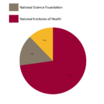

I created the Federal Funding Pie Chart:
- 73% National Institutes of Health
- 15% National Science Foundation
- 12% US Education Dept.
I also Updated
- BC College Research Grant Funding Total
And created the
- Degrees and Certificates Awarded – Bar Graph
Both the Bar Graph and Pie chart consisted of three parts. I created both using illustrator and colored the legend/ key with the primary Brooklyn College colors, maroon, gold and warm grey. Each of us worked hard to keep the design consistent with the previous years and visually appealing.
Speaking of visuals, we had to create two versions with selected images. I keep referring to week 3 entry 3 because on that day we had begun the BC Fact Sheet project. Week 3 we did not work on the document we just went through provided images creating categorized folders of students, campus activities, and faculty. Today Isana had selected images from our selections and asked us for two updated versions by (EOD) end of the day:
- Replacing the basketball img with a cheerleading img on page 1 (FOR BOTH VERSIONS)
- Replacing img of three women faculty with img of man and women (pink shirt) faculty (p2)
- Replacing img of three women faculty with img of man plus 2 women faculty img (page 2)
- Replacing img of students outside reading with pink trees campus image (page3)
- Replacing img of students outside reading with students leaving campus img (p3)
- Keep campus photo on page 4 – do not replace
- Resize img to fit space and current design
As a side bar, I’ve gained more email experience and practice. I was unsure going into the internship how to text a boss. I have been writing paragraphs and speaking clearly with no abbreviations. I once texted Bklyn instead of Brooklyn. Isana did not correct me but I was nervous after pressing send. In previous jobs texting was only for emergencies and seen as a sign of disrespect. But because Brooklyn College interns are all remote we are expected to communicate via our phones. This has been an adjustment for me. It has taken a lot of willpower to put my phone down and not get distracted by my friends / family texts or social media.

