Author Archives: Anna Alvarez
Webinar : 5 Essential Tips for Developing a Brand
Coming across this webinar I thought of it as a beneficial factor for two main things, the internship I was in and developing my own name for a company. There was many things this man by the name of Christopher Simmons. There was many key factor he sated that when creating a logo do it in black or white to see it qualifications as a logo
.
He thank showed many samples what can me used or more so an idea in what direction to take but again only that would express the logo in a better manner.
 Then the process of finding its origins knowing more about the company if you can take it originality and modifier it to be more on the modern side to make something as average into high business. Taking color variation and schemes enable to develop a good campaign.
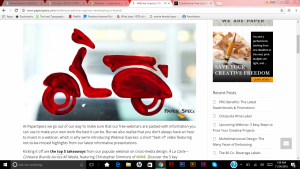
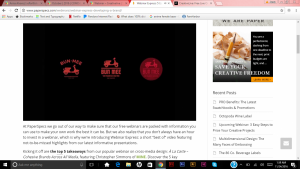
Here is that basic out look of the logo a red scooter but the image below you can see the variation of how the logo will be best supportable for the company. th other thing he stated about the logo that if you are able to wear it on a shirt its a good design.
 Sample shirt view.
A whole new horizon…
Today i thought I was going to get something in regards to shirts or more flyers seems like that was taking his best interest but oh no it was more redoing their web page ( which I have really done in a bit) but he put me at ease not the css/html coding but more so creating a template for this new website. He then released it was going under construction for the zombie fest page. It was an utter shock but I am willing to do my best.
He wanted a site where is can add a videos and body copy along the lines of photos again so for me it was a different experience and a new task and I was really hoping I would not mess this one up. But once again I starts creating the file and started to plan out out once more.
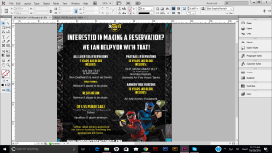
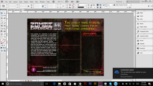 This was the first design creating an developing the lay out how everything was going to look like but through out the process knowing I was not done, I felt like there was some thing missing.
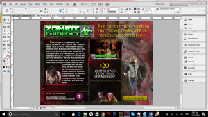 Adding the necessary information It was starting to make sense and it started to make sense the different out on the profile I showed this one he wanted me to change the font and he color.
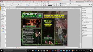 This was the final out look, he was very please with the turn out the empty space is for him to put all the information on price booking and so on and so forth. A lot of fixing things on what to do and what not.
Better Image…
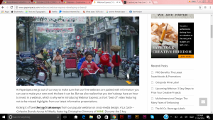
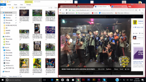
After a few long weeks of problem solving on a new image for the company,he than spoke to me about the new task to just redo their slide shows in the front. Only the best pictures go up there but the previous slides I have see are out dated some and is not funny or interactive. I was selecting photos that would make people laugh from the silly poses to silly faces. Also added few interactive shots with customers more about the promo for team building. for example these of the images i am sorting through below;
 11
11
It was funny to see everyone to see the most happiest hoping to put the other people to have fun.
Dining Etiquette …
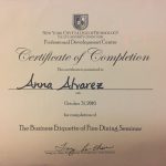
Our class today went to a work shop for dining etiquette. Being said this class showed how sit and how to eat. It help us to understand how to present your self in front of a business diner or meeting. What to do and not to do. Using the different utensils for which dish making sure not taking the fork and putting it in your desert. The instructor was really intense and very much was teaching us how to it felt like boot camp. Overall we listen but as she progressed to show up how slip out soup in the matter of not to slurp.
Especially a whole entire conversation about wine, if your boss reuse you should too. Not to drink so much or offer to get he wine will the boss is paying for the bill it comes wrong and would not look in your favor.
Overall the experience was great and learned a lot from it, I would like to definitely shout out to the chefs of the day the food was amazing well served and beautiful. They did an awesome job catering to us and making sure that everything was to our satisfaction.
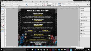
Flyers on the waiting pt 2…
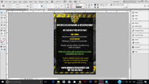
After finishing the previous flyers I continued to work on the second flyers that belong on top of the tables. This was a little more flustering working with a smaller space area, so you really have to make things seem evened out and not cluttered up. Doing the same process that I did with the other flyer the main thing was switching colors and making it different than the other flyers I created I came up with the flyer below having a little more sense I what the client wants.
We felt as if can be played around a little more, whether it was color of font variations to have the information pop up more or the most. Creating a new flyer below. he was content with this flyer along with the other one.
Flyers for the waiting…
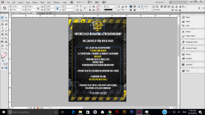
The next assignment was to work on flyer for parents that would linger around the table while the child was playing or straggler that didn’t want to play and just came watch their friends play. Then as well doing flyer for the bathrooms while they are washing their hands and the first thing that they see in the flyers hanging by the soaps. Using the basic information that would describe each game play and pushing customers to ask more questions at the front or to get them to book for a party.
I started using various of colors ad images to make something eye appealing and have the customer interested to read. I started use a template and have a bounding box lowering the opacity so the non of the colors are inflicting with each other.
From here I started to mess with position of text and images. Right away I started to dislike this positioning, it felt it like one size weighed more than the other side. Finding the right size positioning was getting a little frustration.
I then positioned the text and images tying to make it symmetrical in mid paintball combat, we were pleased with this flyer.
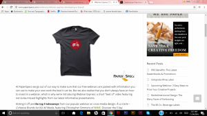
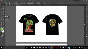
Revised Shirts
Another day working on the shirts. He went over the Previous designs he stated a little more he was looking for and it was definitely more text than imagery. So I worked with type, worked with different phrases and what would work and what does work. It was coming up with catchy things. But in the time I was thinking all things that can kids and adults buy the same sweater or shirt.
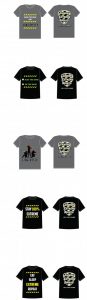
I still try to incorporate some imagery to see what fits but he really wanted text. Something he stated that he really like. Which was more of the black shirts he rely like the phases on the. But then we had to change the color because it was like OCD to have everything match the facility I help out and picked the color even though he was really happy about it (I just though staff and or customer blending with the walls hahah). Once again very content an happy with the turn out.
Needing answers and doing updates…
The starting of my day, I brought to Chris attention about the snap chat. They told me they love it buuut they have to put the idea on hod in the mean time. It was due to the fact they were renovating the whole facility. ( I see what they mean when somethings does not follow through right away) but he stated he will go through the idea once everything is done. I looked up pricing and he has the filter so everything is labeled and pending till further notice.
Today I started put everything together as far as sketches and designs and see what work and what didn’t work.
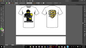
There some things I wondered about the line variation, if the thin lines would even show or even print so somethings had to be become solid or thicker.
I sent him so far the things I worked on some he liked and some he didn’t like ( you can just tell). So he stated to go in a different direction which liked the typography shirts that I made along with this one.
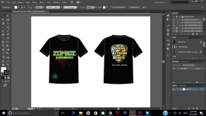
So I came up with some tag lines and worked with variation of color and fonts to see which worked better and I ended ending the day making changes.
A whole new image…
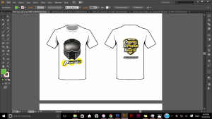
Continuing to work on the shirts, I looked up some designs for different events that they had at the facility. I was dealing with a lot editing of vector and looking for display fonts. it was very tedious and frustrated. At that moment I wanted to have magic powers and make everything appear as I thought of something. Just had to take a breaks and 2 coffee breaks to thinks of new things.
I started to mess with shapes and what directions to go the shirts started to look too artistic not something a paintball place would have. So I had also looked at the old deigns that they recently have. I picked some things here and there to see things that I can use for the future an nit pick things he liked and see if I can alter somethings around.
There is still some planning to do.

