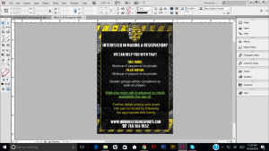
After finishing the previous flyers I continued to work on the second flyers that belong on top of the tables. This was a little more flustering working with a smaller space area, so you really have to make things seem evened out and not cluttered up. Doing the same process that I did with the other flyer the main thing was switching colors and making it different than the other flyers I created I came up with the flyer below having a little more sense I what the client wants.
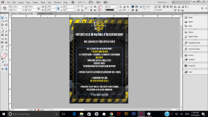
We felt as if can be played around a little more, whether it was color of font variations to have the information pop up more or the most. Creating a new flyer below. he was content with this flyer along with the other one.