Ulmer Question:
Considering corporation and commodity is the institution and the make up of electracy, would you say that electracy has been fully integrated within society? If not, what would that look like?
I ask this because in society now we have come to a point where everywhere there is something to be advertised. There is always something new to be desired and corporations take advantage of this by putting up ads, whether outside or inside your home (watching T.V or browsing the internet). These ads organize us in a way, where we go out and buy things to satisfy ourselves and fulfill instant gratification. I believe that we have already entered the era of electracy as identity has become a way of branding however, if we have not, what would this be like since it seems we already practice electracy.
Madrigal Response:
In the article Madrigal talks about what culture jamming is and how it is done. He talks about how activist positioned themselves against corporations and was able to do so by either getting people to ignore the ads or deface them so that they lost money. He describes the challenges activist face now that a lot of advertising happens online, considering the advancement of technology, and that most ad viewership happens privately. How now, Google and Facebook ads are cost-per-click, which means that a consumer would have to click on the ad to view it and that doesn’t cost the corporation much. That when someone doesn’t click on the ad corporations aren’t losing out on anything. He talks about activist needing to shift their way of protesting, by having as many people as possible click on those ads where these corporations would lose a considerable amount of money. He talks of using data as a way of protesting both the algorithm in place and overall, the corporations.
Reading this article, I realized that a lot of protesting does happen physically, and that activist haven’t tried using data against corporations. With behavioral data and advertising, protesting can be effective if activist focused on using it as a tool, disrupting the information that is gathered and used to curate “personalized” content made for us. I found it interesting that corporations have ads that are cost-per-click, meaning that they thought of the fact that often the people who click on the ads will most likely make a purchase and those who don’t aren’t changing anything. I find culture jamming to be useful in connecting with different audiences as it can be relatable or even the “quiet part said out loud.” I agree with Madrigal that to combat these ads there needs to be adjustments in how it’s to be done.
Culture Jam:
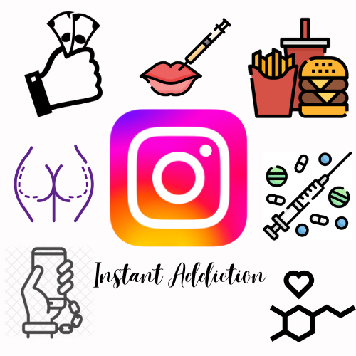
In this culture jam I used the Instagram logo and changed the name from Instagram to Instant Addiction. Around the logo, I put the things that people can become addicted to while using the app which is money, plastic surgery (Brazilian Butt Lifts and lip fillers), fast foods, drugs, our phones, and the likes we get off Instagram. I also included the like system and the dopamine chemical structure. I chose Instagram because it is one of the social networking platforms that most people use, including myself, where people show the “best versions” of themselves. We are constantly exposed to the lives of others and through their like system, seeking validation can become addictive. People will then post themselves overindulging in unhealthy foods, post anything for financial gain, get plastic surgery to keep up with others, and do any and everything to get a like. It is addictive like getting a high from drugs and can be a removal from reality, which in the long run is dangerous.
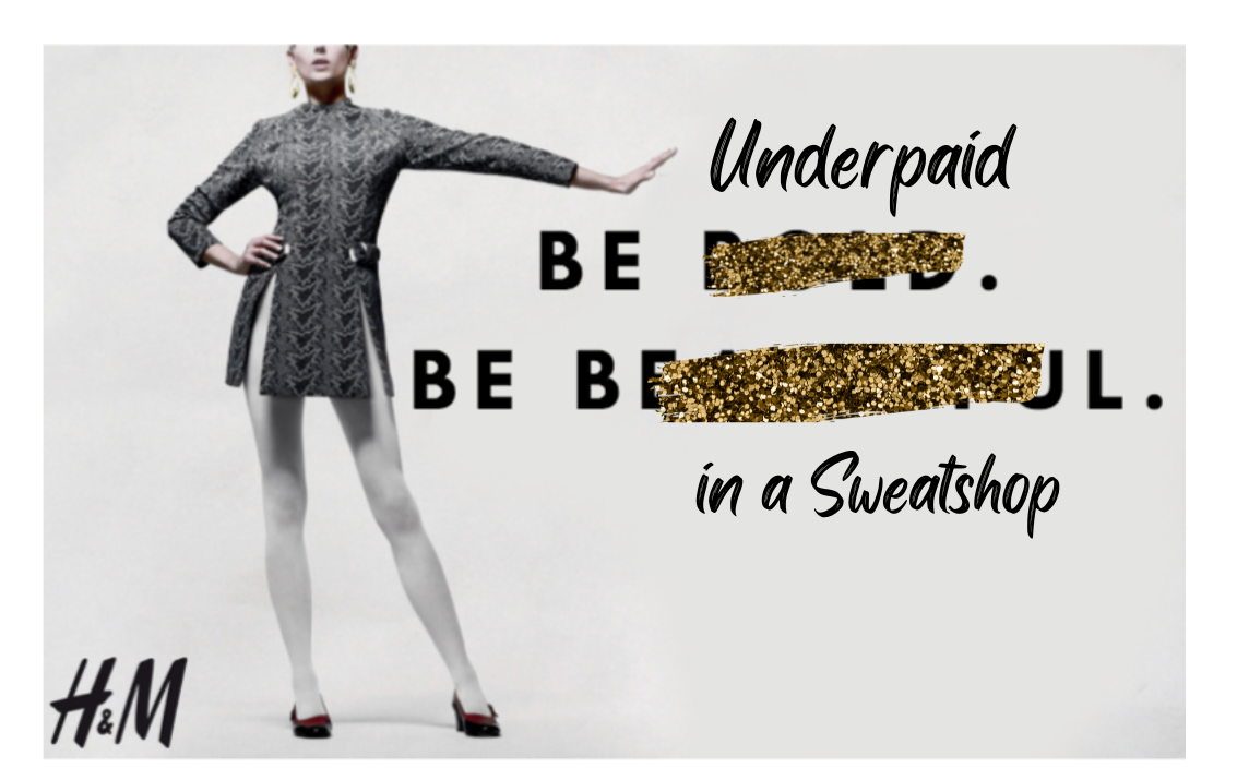
In this second culture jam, I used an H&M ad that says “Be bold. Be beautiful,” I then covered the bold and beautiful and replaced it with “underpaid” and “in a sweatshop.” I chose H&M because they use cheap labor to create their fast fashion clothing. Though they have tried to make progress, they still get their products made in sweatshops and exploit the workers in Bangladesh, Cambodia, India, Indonesia, and Sri Lanka. They are severely underpaid, working under poor conditions, and risking their safety. I wanted to highlight this exploitation by using one of their ads and to create my culture jam.
Reference
Hitchings-Hales, J. (2018, June 5). Hundreds of H&M and Gap Factory Workers Abused Daily: Report. Global Citizen Organization, https://www.globalcitizen.org/en/content/hm-gap-factory-abuse-fast-fashion-workers/


Image #1:
-I like all the surrounding artwork around the Instagram logo, shows the extensive addiction.
-Not sure what the bottom right picture of shape and a heart is in correlation with, it can be made clearer.
-I think you can get more in the message by getting rid of the ‘nt’ at the end of instant. So, it reads insta addiction, it’s closer to Instagram. Insta Addiction instead of Instant Addiction.
– Get rid of the background lines on the bottom left with the hand tied to the phone, it is different from the rest of the images.
Image #2:
-I like the words in your message, it is very bold.
-You did not cover up the second line very well and it had me confused when I was reading it.
-Instead of just covering the “be bold” and “beautiful”, you can just replace it with your words, so it looks like they wrote it. This will make the culture jam more interesting if it looks like the real thing.
-You can make the H&M logo bigger and right underneath the message so when they read “be in a sweatshop” they also immediately read the logo.
Image #1
Image #2
Image #1:
I love the message of your image. I think that you can tie these ideas together by maybe adding someone looking at their phone and somehow bringing all the images together.
Image #2:
I liked that you slashed out the logo with glitter and glamour. I think it’s a really nice statement that represents that fashion industry. I think you could add more to this image by maybe adding a cut out of a sweatshop worker under the text.
For Image #1.
I love the message you sent out, well written and beautiful. I also feel the same about Instagram it just draining and damaging for us young girls. There are no flaws in your image. I think it was perfect.
For image #2
I also love the message and image. Very creative and well-written.
In creating first image, I reviewed the list that Professor Leston provided and settled on using Canva. While on Canva, I decided instead of using the many templates available I would rather create my own design. I then copied an image of the Instagram logo from Google and placed it in the center of the white board (on the website). I then tried to find a similar font to the font that Instagram used and decided on the font called, best light. I then thought about what I see on Instagram and how I navigate the app and decided to place icons of things that users (some who have large platforms) on Instagram promote. So, I looked up each icon on Google, copied and pasted it around the Instagram logo. I put the hand with the money; this was to signify the high consumerism that happens on the platform, the Brazilian Butt Lift and lip filler icons; people are subjecting themselves to plastic surgery, which can be very dangerous, for quick results and in an effort to look “perfect” for branding.
I then used the fast food icon to represent the unhealthy binging of fast foods in the name of Mukbanging, I placed the syringe and pills icon to signify drug use, as some people promote drugs by posting it in their stories, and finally I put the dopamine chemical structure with a heart icon, representing the pleasure and satisfaction some physically feel when receiving validation from someone liking their post. And the phone and cuff icon, to represent the addictive behaviors we have with constantly being on our phones and on social media. During this process, I copied and pasted and sorted the images. Originally, I wanted to make the Instagram logo a bag with the icons coming out however, I found that Canva didn’t provide writing tools to do so or even the ability to really photoshop. For the second image, I used the same website. I used the whiteboard where I copied and pasted the H&M ad, then used the line elements provided and chose the gold glitter to cover the “bold” and “beautiful” and replaced it with “underpaid” and “in a sweatshop.” I wanted the ad to look cohesive to the original, so I used the black bones typeface and the glitter to make it feel more on brand while delivering my message. What I found challenging was manipulating the ad, again because Canva doesn’t provide full photoshopping abilities and can only use what is provided. Next time, I would like to make my H&M culture jam more of a detournement by changing the image completely and placing the message in a more abstract way. For my Instagram app I would probably change the name and work on making the bag using a different program, possibly with Adobe.
Image 1:
I like the supporting images surrounding the Instagram logo. I think it builds on the severity social media plays on our society. I don’t know how food influences people on Instagram… maybe add another image or text saying how or why. overall great message.
Image 2:
i didn’t know that H&M clothes were being made from people in sweatshops so this was very interesting and enlightening to know. I like the highlighted over the text explaining what’s being done in the sweatshops.
Image 1. Instadiction seems like what you are going for. The dopamine structure is cool but it does not come across. I wonder it you could have something going around the image in purple or something that had the word dopamine and the chemical structure.
Image 2: Chances are your reader is not going to know that it once said Be Bold and Be Beautiful since it’s completely blinded out. Maybe you are looking to use a strikethrough, where there is a line or an x over those words so that we can still see them. I’d also suggest some kind of image related to the sweatshop conditions.