FINAL PROJECT SUBMISSION LINK
Featured
Reply
WHOoooo ARE YOU?
As Promised … Today’s Lecture.
Power Point: character-design-intro
PDF: expressionguide
PDF: character_heads_and_features
As Promised … Today’s Lecture.
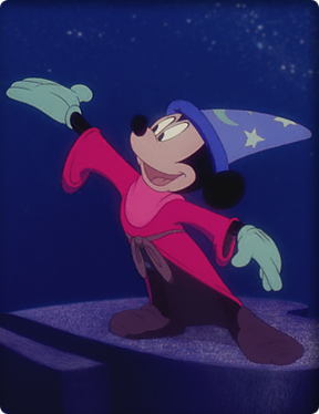
Power Point: model-sheets
PDF: model-sheets
Model Sheet Sample:
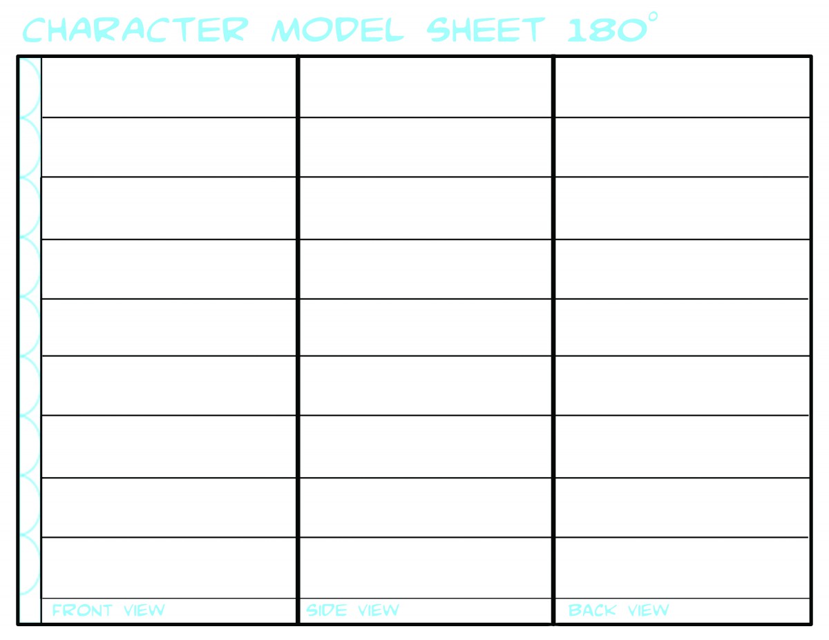
You may use this OR search for another/ design another better suited to your needs.
DUE: DEC 19 | Week 15
Final Project due with Peer Critique
Project Description:
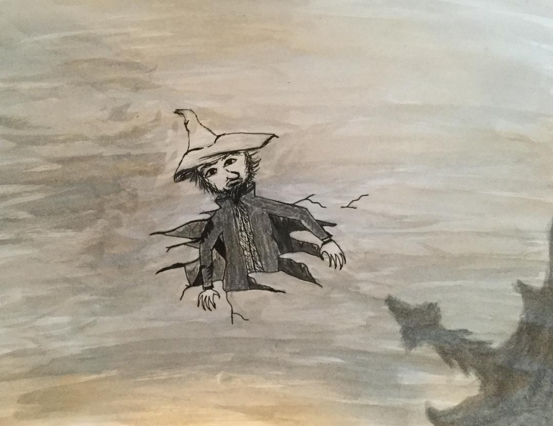
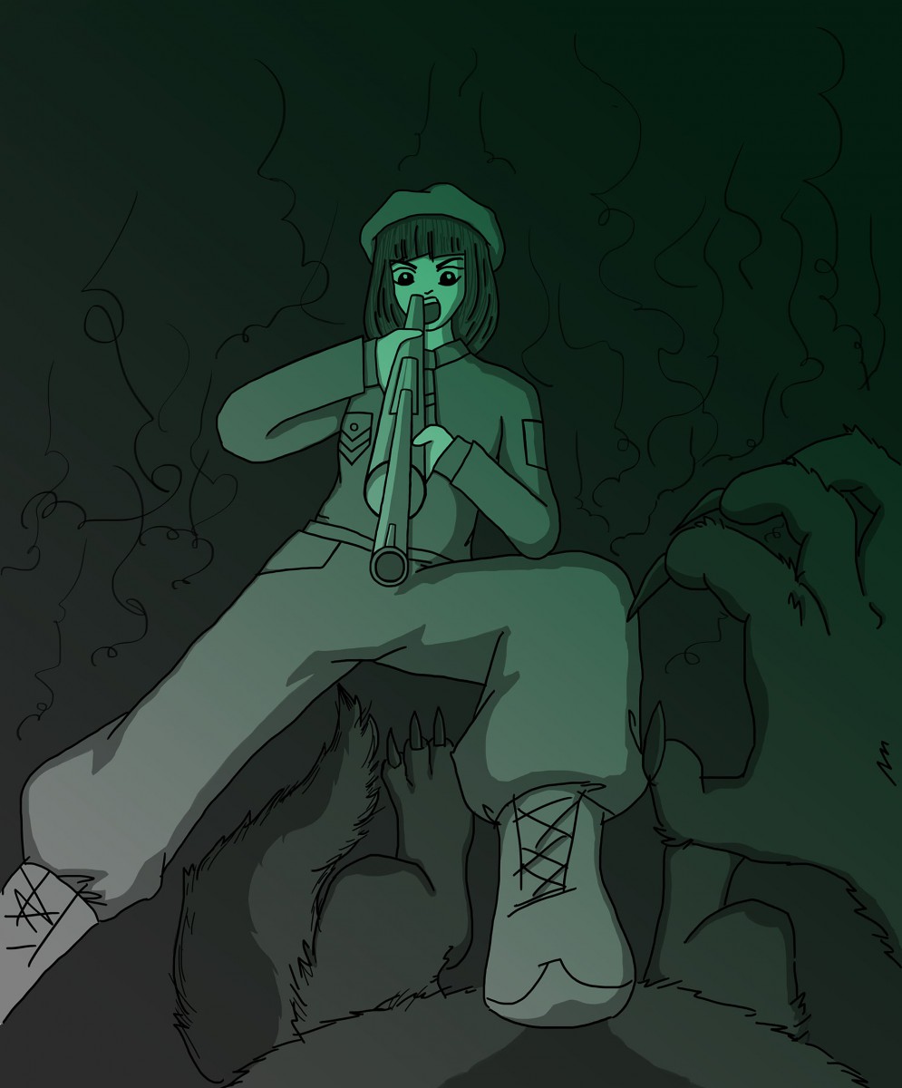
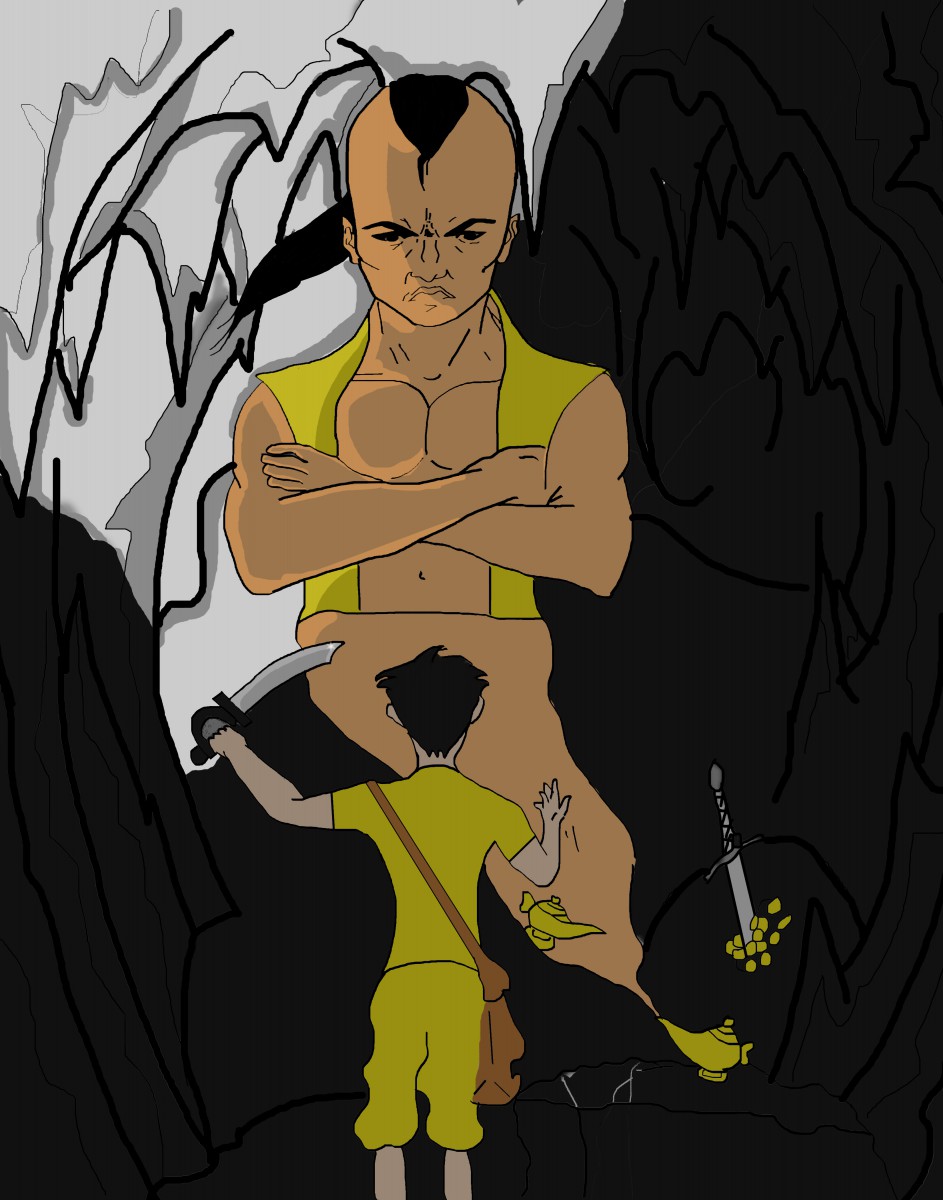
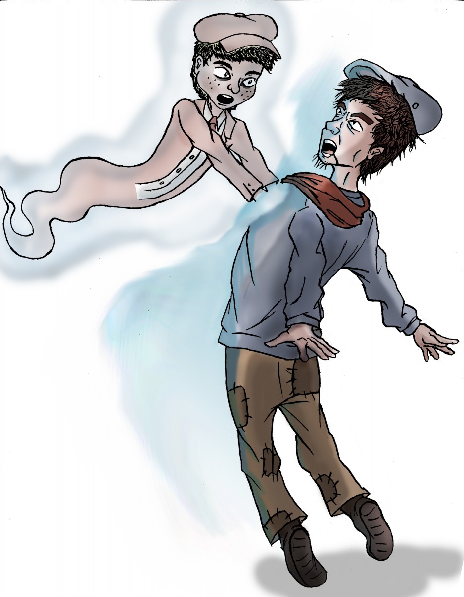
Part 1: Using the characters and concept created for Project 3, create concept sketches for 2 narrative illustrations featuring the same character(s) in a different setting and situation.
Part 2: Incorporating feedback from your instructor and peers, finalize one of the 2 sketches into a final illustration. Create values studies and color studies as part of process work.
Final Art can be made using any combination of traditional drawing / inking skills and digital coloring. Final art must make full use of value and read as a finalized piece of art work. Final art may be in Color or in Black and white. If in color a limited palate is highly recommended.
GRADING BREAKDOWN:
50 % project grade Submit a PDF PROCESS BOOK guiding us through the project from inception to conclusion.
50 % project grade Submit a publication ready 300 DPI JPEG of Final ART
_____________________________________________________________________________
SUMBIT YOUR WORK
Absolutely AMAZING character design and concept art library for animation! THIS IS A MUST SEE!!!
 LIVING LINES LIBRARY
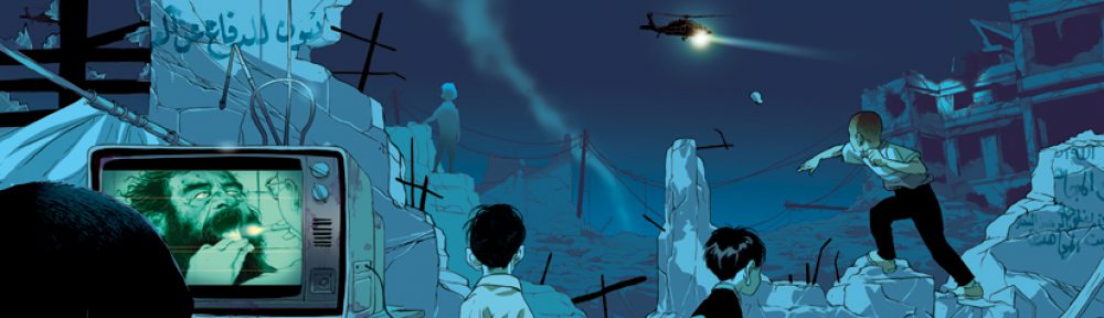
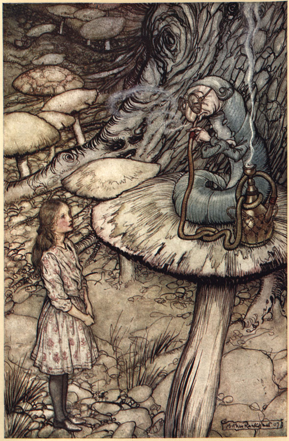
Project 4: Character Design & Concept Art
Overall Description:
In this multilayered project you will reinterpret a classic folk tale or fairy tale through your own creative lens.
For this part of the project you will develop characters for your original concept.
These characters and concept sketches may, but are not required to be in color.
Art can be made using any combination of traditional drawing / inking skills and digital coloring.
This project leads into our FINAL PROJECT.
______________________________________
Project 4 GRADING BREAKDOWN
75 % project grade Character Design Model Sheets, and the 6 Basic Expressions or more for at least 2 characters.
25 % project grade Written Post. (PROOF READ YOUR POST. SPELLING AND GRAMMAR COUNT.)
Nov 28 | Week 12
DUE: Project 3 FINAL Art.
DUE: Narrative Illustration Proposal
NEW: Project 4- Narrative Illustration Character Design Rough Sketches
Dec 5 | Week 13
Work in CLASS on Narrative Illustration Character Design & Concept Art Rough Sketches
NEW: Project 4 – Narrative Illustration Character Design & Concept Art Rough Sketches
NEW : Thumbnails for Final Project Narrative Illustration (Get approval early on openlab for MORE WORKING TIME!!!)
Dec 12 | Week 14
DUE: Project 4 – Narrative Illustration Character Design & Concept Art Rough Sketches
DUE: Thumbnails for Final Project Narrative Illustration.
NEW: Concept Sketches for Final Project.
Dec19 | Week 15
Final Project due. Peer Critique
PROJECT 3 : EDITORIAL ILLUSTRATION
Overall Project Description:
Create an Editorial Illustration for use to accompany an article in a magazine, printed or online. This project is broken into stages with peer critique and critical feedback given at each stage, spanning 4 weeks in total.
Work will be judged on the clarity and cleverness of the overall concept, thoughtful utilization of composition, the use of value, and of course the skillfulness of overall technique.
GRADING BREAKDOWN:
_____________________________________________________________________________
Color is one of the most powerful aspects of making art. Almost everyone who loves to create can remember the childhood excitement generated by a brand new box of crayons!
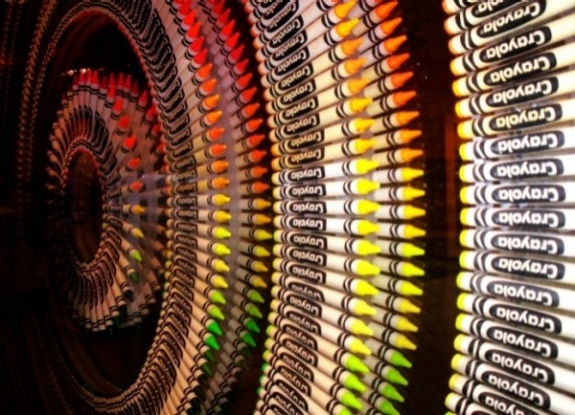
Everyone has a favorite color, artists and non-artists alike. Our relationship to color is one of the most powerful relationships we have as a species. It is intrinsically connected to how we relate to our world. And so of course it is one of the most powerful aspects to consider when making art.
Color Temperature
Much of our relationship to color is based on instinct. For example, we see colors as warm or cool based on our physical response to them.
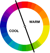
Warm things are warm colors (such as fire, the sun, hot coals, and in this case hot food.)

and cool things are cool colors (such as water and ice, which as blue or bluish).
Interestingly warm and cool colors also create a sense of perspective and depth when we look at an image. Warm colors tend to advance towards us, whereas cool colors tend to recede away from us.
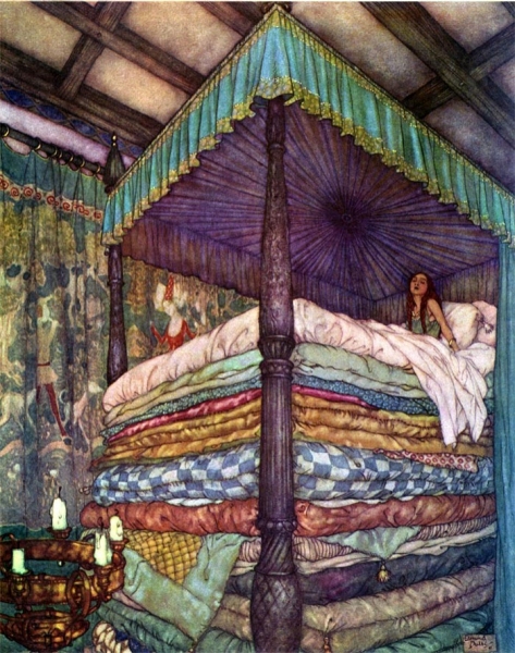
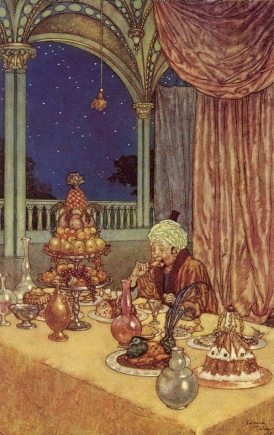
In these two images note how early 20th-century illustrator Edmund DuLac uses this trick. In the first image of The Princess and the Pea he creates a sense of incredible height, as the cold blue-purple recedes from the viewer, effectively raising the height of the bed canopy. And in the second one, A Palace of Wonder, a sense of depth is created between the warmth of the interior space and the cold dark outside.
COLOR AND CULTURE
However, a great deal of our reactions to color are not innate, they are in fact cultural. For example Black and Death are associated in many Western cultures, in many Eastern cultures it is associated with white—its direct opposite.
Take a look at this info-graphic. Note how many color associations change, depending on where you are in the world. However also note how HOT and COLD or Color’s Relationship to Temperature do not.
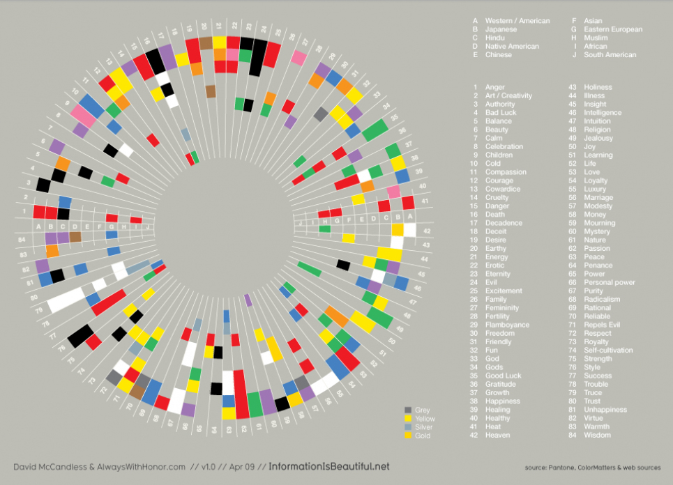
It is however important to understand your target market and the culture that they come from, because culture has a strong influence on the development of cultural-color associations in childhood building the adults eventual perceptions of color.
Throughout this module and the next we will look at these basic reactions we all have to color and learn to compose in color effectively. We will build on what we have learned regarding composition, concept, point of view, and value and we will see how we can use these reactions to color to aid us in our ultimate goal, telling a great story through narrative illustration.
However, before we can do that lets be sure we have down the basics.
NEXT STOP: The Color Wheel
WHILE IN THE MUSEUM: Take notes and photograph images. Write a short blog post about one illustration from the exhibition that you found particularly interesting. Research the artist and the subject. Learn as much as you can about the working process.
Describe what interested you about this piece in a few short, well written paragraphs, (200 – 300 words.) Consider the illustration’s context, what you’ve learned through your research about the illustrator, as well as their use of media, subject matter, and technique – in addition to your personal opinion.
Submit it along with a photograph of the art work and its creator, to our OPENLAB site.
 Fill 4 pages in your sketchbook with things YOU find scary or creepy. This is totally up to personal interpretation! Theres no right or wrong! BUT be sure you draw FROM OBSERVATION.
Pay attention to line weight! Try to use value to SHADE your drawings!
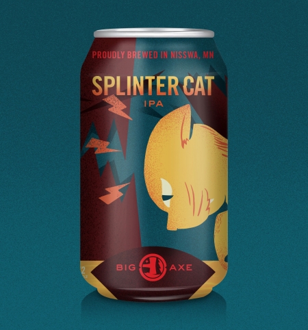
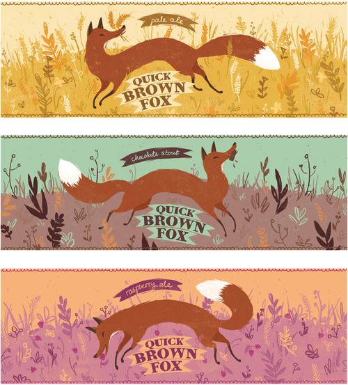
Hello class-
As each of you is designing your concept sketches it is very important that you keep in mind the project specs (i.e. size, shape, colors requirement, and resolution) of the final art work.
So the art created for a beer can like the one below would be different than that created for a beer bottle or a wine label.
PLEASE keep in mind that you should feel free to be creative with this. A label might have a rectangular or square shape, but it DOES NOT HAVE TO. Not that the ones below do not. So when deciding on the overall shape, do what will make for the better and more unique overall illustration. The only rule is that it MUST BE FUNCTIONAL. If you are not sure, use a photocopier and cut out your concept sketch and test it out on an actual bottle or box.
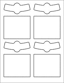
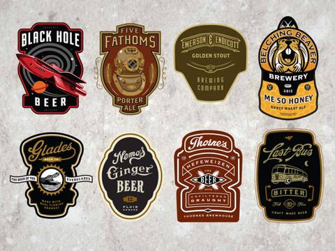 I’m including below some TYPICAL label templates as a helpful tool. They are meant to print on 8.5 x 11 paper. You don’t HAVE to use them. Look at creative illustrated packaging for inspiration. And really as long as it could actually work, the sky is the limit!
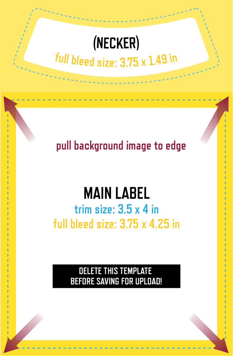
To get an idea of sizes: TYPICALLY a rectangular Wine Labels like these (theres also the little wrap around necker which you can choose to design or not!) are around 3.5″ x 4″
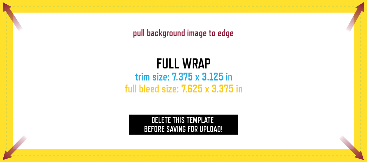
 But you can also choose to design a wrap around image like these …
AND AGAIN… IT’S UP TO YOU. YOU DON”T have to conform to these shapes unless you choose to. But be sure no matter what you choose your design will WORK.
Beer labels are typically 2.5″ x 3.5″ for the most basic, and 7.375″ x 3.125″ for a wrap around. And again… this is your call. Wrap arounds will provide you a little more room to illustrate, but do what will work best with your design.
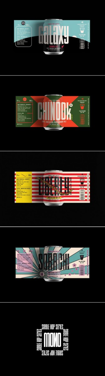
As for illustrated cans… which offer a larger space to play with, copy the proportions of the examples below as I was unable to find a template for you. And again, prioritize making some really creative and well illustrated images over conforming to the examples!
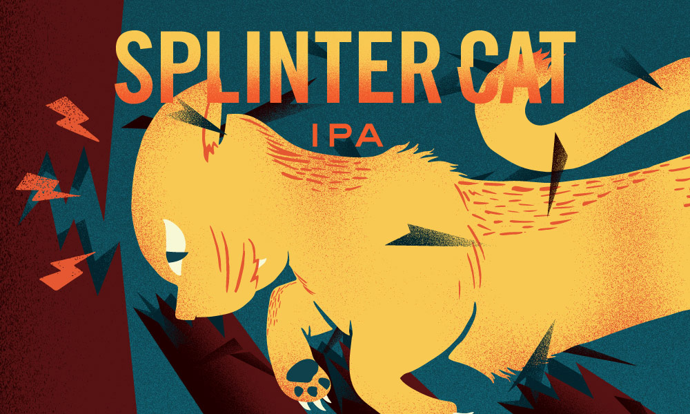
Here are a few more sites for MORE INSPIRATION!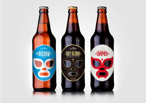 http://www.ohbeautifulbeer.com/ (look at SPLINTER CAT! among the other awsome examples!)

Welcome to Illustration 1! Our goal in this course will be to give you the professional tools used by illustrators working in the field today. As well as to cultivate your personal vision s an illustrator.
On this site you will have access to materials presented in class, your weekly assignment pages, and additional helpful resources. Here you will also post your assignment images to share with your classmates. Carefully read the directions below on how to post to this site and to your ePortfolio.
Upload scans of your assignments from this semester in the Projects Category on this site and also in your ePortfolio. Be sure to give your project a clear title. On our class site, write a brief description of the project, and be sure to reference the title. Also be sure to include in your post the Process Work. A complete project must include all Process Work as well as the finalized art. Your descriptions should include what your goal was for the project as well as, what you learned from making it, and what was challenging to do. Of course you may write other comments as well. For instance, you may ask questions for other students to answers.
How to Post to our class: On this class site, go to Post located on the left > Give your artwork a title in the subject line > Write a brief description of the artwork in the Comments space > Just above your title click on the Add Media icon (it looks like a camera on top of a music note) and browse for your file > Click Insert > Click Drawings in the list of Categories on the right > Click Publish at the top right.
Your desicription should include what you feel the aim of the drawing was, what you learned from making it, and what was challenging to do. Of course you may include other thoughts as well.
How to Post to your ePortfolio: Go to Dashboard > New Page > Pages > Add New > Locate “Parent” in the Page Attributes > choose “Academics” from the pull-down menu. In the Title area of your ePorfolio, be sure to write the name of our class (Foundation Drawing) or our course code (ADV1103). Also be sure to Publish, and invite me to join your ePortfolio. In settings, be sure to state either “Public” or “Private>visible to City Tech members.” Otherwise no one will be able to see what you’ve posted.
To take the photo, find a spot with even light so that you will have no shadows or strange light gradations across the drawing. Frame the drawing so there is a small even frame on all sides. Optimize the file, or reduce it to 72 dpi, with a file size no more than 1MB (about 8-9 inches on one side). Rotate it if necessary to it uploads right-side-up. If you have access to any photo-correcting program, see if you can increase the contrast so that delicate drawing lines are visible.
When you have questions about this class, or the assignments please post them here, so that answers benefit other students who may have the same questions.
By tagging your posts with the category, “office” any questions you have for me will appear here on this thread, and will be easy to find for all of us.
If you need to communicate with me privately, please email me at SJWoolley.citytech.cuny.edu
or you may stop by my office hours:
N1126 Tuesdays 10-11am
N1126 Thursdays 10-11am
DUH… I DRAW IN IT.
YES… I agree. This seems pretty obvious.
Any student who has studied drawing at all has probably been keeping a sketchbook for at least the past semester, if not for years. But please bear with me and read on. Regardless of the simplicity of the tool, there is a reason ALL serious artists keep a regular sketchbook practice, and there is infinite room here to learn, grow, and develop your craft.
Your sketchbook is the place in which you will really improve your drawing and idea generation skills. It will, by developing the habit of daily use, become a PRACTICE. No different than a daily meditation practice. And it should be thought about with similar rigor.
Throughout this semester, and hopefully moving forward you will keep a sketchbook that you will work in every day. It will become a depository of ideas, a place to work on your concepts, and a place to draw both what you see in your daily life as well as what you see in your imagination.
For now, focus solely on DEVELOPING THE HABIT.
Every week you are required to share pages from your sketchbook here. Be sure to Title your post! Include the Week and the Theme if you are given one, or make up your own title! Keep the image file SMALL. 72 DPI is fine.
Sketchbook Requirements:
Be sure to comment on each other’s sketches.
DISCUSSION:
Please reply to this post acknowledging that you understand the requirements and purpose of the sketchbook. Also please let us know in a couple of sentences about your sketchbook experience and what kind of things you like to sketch!
Lines are where most people begin when first starting to draw. By themselves, lines are powerful drawing tools! They have shape, texture, and weight, all of which can add up to a very expressive drawing if you’re thoughtful about their creation.
When beginning a drawing, people often carefully inspect an object’s outside edge, or silhouette, as a starting point. They render each line representing an edge or contour. Next, people usually fill in those contours with value.
However, so much can happen using just line alone! A line by itself is capable of conveying all sorts of emotions. In your drawings, lines can and should have life.
In ink take five minutes to draw as many different kinds of lines as you can imagine. Try different movements with your hand, drawing lines from your wrist, your elbow, and then your whole arm. Try different amounts of hand pressure, creating straight lines, parallel lines, curves, and spirals. There’s no wrong or right answer here! This freeing exercise will help open up your expressive drawing skills, warming you up to this medium.
German expressionist Egon Schiele is a master of the living line. In these images note how he uses nothing but varying kinds of line in order to imbue these portraits with interest and emotion.
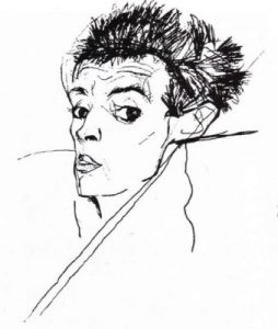
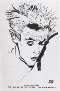
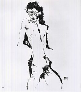
Part of what we see creating the sense of liveliness and emotion in Schiele’s lines is an incredible understanding of line weight.
Line weight is an important drawing concept. Different tools create different kinds of lines, and allow us different methods of varying line weight. A line’s weight, meaning how dark or thick it is, will make that line either move forward in an image (if it’s a strong, dark line) or sink farther back (if it’s light or thin). This is useful when trying to give the impression of something being closer or further away. A heavier line weight will also create emphasis on a particular area of a drawing, which is of course useful in creating our focal points.
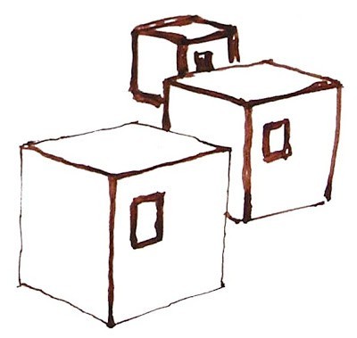
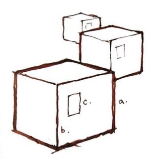
In the two images shown here, note how the image on the left is logical. The closest block is also the one with the thickest contour line, which makes visual sense. However, in the image on the right, the line weights of the blocks don’t follow the correct hierarchy, as they don’t recede in space logically.
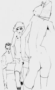
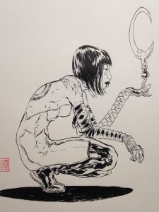
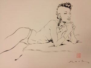
David Mack, contemporary comic book illustrator and creator, is known for his linear figure drawing style. In the next series of drawings, notice how Mack uses only contour lines in order to describe the body. It’s useful to note that he cites Schiele as an influence to his work. His expert use of line weight is especially obvious in the implied shadows that convey a feeling of gravity entirely though varying thickness of line.


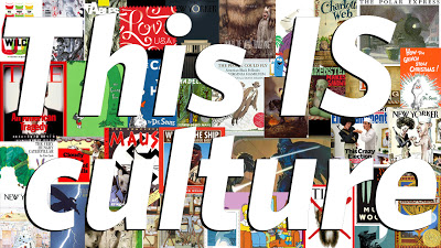
Please Read John Hendrix, This is Culture.
In a few sentences discuss the article. Consider questions like:
What does Hendrix Define Illustration as?
What does he mean when he calls illustration a “powerful, profound, and unpretentious shaper of our visual lives” ?
Be sure to read eachother’s observations BEFORE posting your own.

The OpenLab is an open-source, digital platform designed to support teaching and learning at City Tech (New York City College of Technology), and to promote student and faculty engagement in the intellectual and social life of the college community.

 Society of Illustrators