Paul Rand
Paul Rand is a famous American art director and graphic designer who was born August 15th, 1914, but died on November 26th 1996. Rand’s work is seen all over in media and has also influenced many people to date. He is most known for his logo design work, along with his books and as some like to call it “clip art design” work. Like most graphic designers, Rand started to grow an interest in design at a young age. He worked at painting signs for a store owned by his father but also for his school. Although, his father never truly believed art was a stable career choice for his son, Rand continued to pursue his love of art, not only by taking classes at Haaren High School, but also doubling on the work and taking night classes at Pratt Institute. During his time of pursing his career choice, Rand self taught himself. He learned of different magazines, newspapers and other schools both locally and internationally, in this time he gained skills in which he could use to start his career.
At the beginning of Rand’s career he worked part-time supplying graphics by creating stock images. While working and going to school Rand worked on building his portfolio, one, which was large, compared to others around him. Rand often credited his large portfolio to being influenced by the German advertising style of a couple German artists. Although his portfolio was different compared to other American artist at the time, It caught others attention and people actually liked it which boosted not only his reputation but also his business. Rand quickly became popular amongst companies and designers.
Paul Rand quickly became known as the visionary. His work stood out amongst his peers and made people interested in his work. While his work grew recognition, Rand began to work for companies just as IBM, Ford, UPS, ABC and even Apple. While working Paul Rand changed the way people though of design and how logos were created. He came onto the media world with a fresh eye and mind, creating things the world had never seen or even thought of before. He had completely changed the culture of advertising, convincing some of the nations largest corporations that his design, the good design was good business. In 1986, Steve Jobs had trouble launching a start-up for his new company. Although the company was small and not very well known yet, Jobs had invested millions on his new company. Still working out the details of this new software Jobs had in mind, there was one thing he was sure of, and he didn’t want but needed a logo from Rand no matter where his company went. Not only was Rand a man who changed the idea of Advertising, but he also worked as an art director and art critic.
While working as a graphic design, Rand was requested by Apparel Arts magazine to develop their page layout for the anniversary issue. Developing a unique and sophisticated layout for the magazine, which paved the way for his career afterward. After, working on the issue Rand became more acquainted with the magazine world and got experience. After working on the issue, Rand was offered a job as an art critic at Esquire-Coronet. At first, Rand refused the job of becoming an art director for a magazine. Rand believed he was not yet at the level to become an art director and wanted to take all the steps required before he took that step, but after a bit of convincing, he finally took over the responsibility for the magazine.
At the age of twenty-three Rand had already become an art director. During his time as an art director, Rand took charge in directing the cover art of this magazine. Although, he had just started this process he was in the making of creating his own initiative look, he wanted something so when people saw him they knew he had touched or had a hand in creating it. Although, the magazine did not give him the best path in creating his own look, it did give him ideas of how he wanted it to look and what he wanted to be known and remembered as. Rand’s initiative look began to refine once he began to define his corporate identity. He had an eye for what he thought company logos needed in order to be noticed and viewed by the public. He wanted something refined, but yet not basic; he wanted something that made the public think when they saw it. In order to make them think, Rand himself had a bit of thinking to do.
In this time, One of Rand’s clients happen to be IMB. He thought of ways he could refine “The Paul Rand look.” Finally coming to the conclusion he had come to his final design becoming the well-known Eye-Bee-M poster. After the poster surfaced around the public, Ford appointed Rand to redesign their corporate logo. Thus assisting Rand in a way to define and create a look for him. After his time in designing, later on in life, Rand continued on his design work, unlike other designers around him, he did not spend his life becoming an art director or even creating his own Art team. In his life there were a few principals Rand lived by, mainly four which surprised most designers at the time. A few of the principles Rand lived by, were “A logo derives meaning from the quality of the thing it symbolizes, not the other way around “, which he seemed to assign importance and responsibility to something as simple as a logo. Another thing he lived by was “The only mandate in logo design is that they be distinctive, memorable and clear.” Rand clearly believed that design was more than just creating anything; logos were to be crafted and needed to be treated as if they were an advertisement. One other thing Ran believed in was Presentation is key. He believed everything needed to be presented in the best way possible. He wanted to work hard when designing and make others feel the same way about the work. He felt, if time was spent on the logo it should be presented as such.
Paul Rand was not only a visionary, but also a thinker. The way he thought and acted on his designs created a path for designers now. As some say, Rand was the pioneer of iconic corporate logo designs. He himself molded the way logos for corporations are seen and treated when designed. Although, Rand worked hard on entertainment and mainstream logos his true reputation was based on his initiative to work and change how designers treated logo design. Rand believed so much in designs that he even created one of his most notable designs, free of charge. The featured cover of “Direction Magazine” was done not for the money or even to be noticeable, but for the artistic freedom Rand believed deeply in. By doing such a thing, he believed that it would give designers a light to see how much art is actually worth.
In conclusion, Paul Rand decided it was not only his goal to change the way people saw advertisements, logos and art but also to make a brand for himself. He wanted to make artist think the way he did and wanted them to work the way he did.
Sources Cited
Bigman, Alex. “4 Principles by Paul Rand That May Surprise You – Designer Blog.” The Creative Edge 4 Principles by Paul Rand That May Surprise You Comments. N.p., 04 Sept. 2012. Web. 03 Nov. 2015.
Dunne, Caret. “How Paul Rand Pioneered The Era Of Design-Led Business.” Co.Design. N.p., 24 Feb. 2015. Web. 03 Nov. 2015.
Heller, Steven. “Paul Rand.” – Iconofgraphics.com. Iconofgraphics, n.d. Web. 03 Nov. 2015.
Paul Rand | Biography, Designs and Facts.” Famous Graphic Designers. Famousgraphicdesigners, n.d. Web. 03 Nov. 2015.
VANHEMERT, KYLE. “Paul Rand, the Visionary Who Showed Us That Design Matters.” Wired.com. Conde Nast Digital, 06 Apr. 2015. Web. 03 Nov. 2015


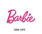 The first logo the Barbie Company used, lasted them almost two decades until the Barbie Doll was created with more of a hippie trademarked look. In order to fit the new design and clothing of the new Barbie Doll, the company changed its logo. Which lead to in 1975: