 Can a typeface really help to improve a city’s image? There are a few people in Chattanooga who think so. It’s a project of a few designers and brand specialists. The city has begin going through a comeback and the designers want the city to accentuate the city’s potential to become the “Silicon Valley of the East Coast.”
Excerpt from Can a Font Help a City Make a Comeback?
Known in the 1960s as one of the country’s filthiest cities, Chattanooga has managed to clean up its act and its image in recent years, with a redeveloped riverfront and an artist relocation project. But the city’s “brand” is out of date and doesn’t live up to the creative energy on the ground, according to the team members.
Take a moment to read the full article and tell me if you think a font can help a city rebrand itself. If New York City had it’s own font, what aspect of the city would the typeface design portray?


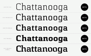
It’s crazy how just changing the font changes the whole aspect of the name. Every single one looks different. If I was to pick one I would pick the third one because its not as bold and not as light like the others. Also it doesn’t have the cuts in the letters like the last one does which wouldn’t really look professional for a name of a city.
If NYC had it’s own font, I can’t even imagine what it would be like, I think you would need to combine all the fonts out to make a font for that city since there is so much diversity. But I would still like some kind of Grafitti style font because of the street life being so broad, the best place to be a photographer at.
Sylwester, since a font can convey a mood, I guess it stands to reason that it could affect the way people think about a city… whether it’s hip and fun or lost in depression and poverty.