Anatomy of Typography

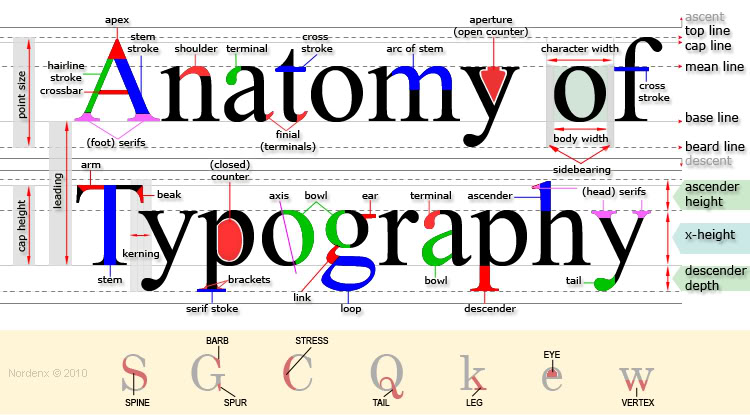
Typography anatomy is a letter of group. Every single letter has a name like a human body. By breaking down you can understand better how type was created. For example counter-the inside of a bowl, leg-the bottom stroke of a letter, and shoulder-the curve at the beginning of a leg of a character. Most of the terms come from Greek, Latin, and Dutch. Here is one picture for example:

anatomy_of_typography

Bad Kerning

url

The spacing in this one is to far from the other letter; therefore, it reads with no sense. Instead of “only” we all can see “onl and Y. “ The same thing is with “Buses.” A person who wants to make a sign has to know how to carve, has to know how to space them correctly, and how to place in a good place so that everybody can read and understand the meaning of it.

Welcome!

This is the first post on your Learning Blog. Edit or delete it, then start blogging!

The ePortfolio is both a Learning Blog and an Academic Career Portfolio. Use the Learning Blog to document your learning experiences and class assignments each semester. As time goes by, add content to the Academics and Career sections to show your department, graduate institutions, or future employers how well prepared you are for your chosen career.

NOTE: Remember to add appropriate Categories and Tags to your posts. This will help your professors and other visitors find the content they are looking for. The Categories “Coursework” and “Field Trips” and the Tags “OpenLab” and “City Tech” have already been applied to this post. Feel free to make changes!