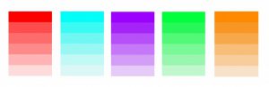
Journal Entry 4/21/17

Three Companies I’d Work for

B-Reel

This is a digital production company. It creates webpages. Which I would love to do.

StinkDigital

This company is cool because it creates apps. It’s also another company that helps create websites.

DomaniStudios

Is a company known for designs and creations. They work with some of the largest brands. They advertise. I would love to work for them because I think it would a cool experience.

None have any internships going on

Posted in Uncategorized | Leave a comment

Journal Entry 4/7/17

Proportion

Formal: The relative size of parts of a whole. (Sophia.org)

Informal: Parts of a whole piece.

Rule Of Thirds

Formal: aligning a subject with the guide lines and their intersection points, placing the horizon on the top or bottom line, or allowing linear features in the image to flow from section to section. (Wiki)

Informal: A precise proportion

Golden Rule

Formal: a line is divided into two parts and the longer part (a) divided by the smaller part (b) is equal to the sum of (a) + (b) divided by (a), which both equal 1.618.

Informal: Sections of a image that makes it stand out.

Posted in Uncategorized | Leave a comment

5 Templates Of Transparency And Layering

Posted in Uncategorized | Leave a comment

Funny Venn Diagram

Posted in Uncategorized | Leave a comment

Design Journal 3/31/17

Tonal Progression

Formal: A succession of color mixtures proceeding from dark to light. (Theryderstudio.com)

Informal: Colors ranging from light to dark
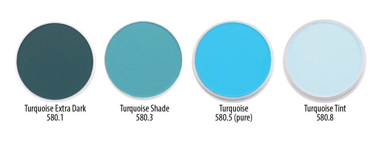
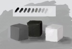
Shade

Formal: A color, especially with regard to how light or dark it is or as distinguished from one nearly like it. (Google.com)

Informal: Black and white from light to dark

Tint

Formal: The mixture of a color with white, which increases lightness, and a shade is the mixture of a color with black, which reduces lightness. (Google.com)

Informal: Colors getting lighter
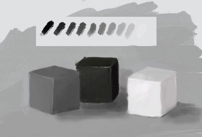
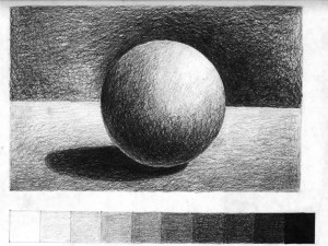
Tone

Formal: This refers to the lightness or darkness of something. This could be a shade or how dark or light a colour appears. Tones are created by the way light falls on a 3D object. The parts of the object on which the light is strongest are called highlights and the darker areas are called shadows.

Informal: The way a shadow appears on an object
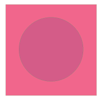
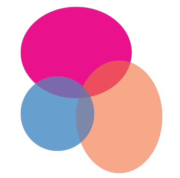
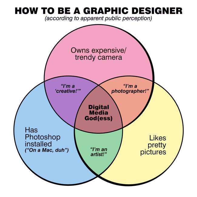
Venn Diagram

Formal: a diagram that shows all possible logical relations between a finite collection of different sets.

Informal: Two circles colliding showing differences and similarities.

Posted in Uncategorized | Leave a comment

Journal Entry 3/21/17

My favorite design principle would be movement. I chose movement because this principle catches the audience eye and it doesn’t have them stuck on one part of the image. It keeps the eyes moving so they can see the full visual piece. As an example, the image that I’m showing makes you look at the picture all around. The organic shapes makes the design flow very nicely.

Posted in Uncategorized | Leave a comment

3 Subway Platform Photos


The man is the first thing you see in this photo. The words on the top left corner is the second thing you see. The words on the bottom come last.


The astronaut with the hand is what caught my attention first. Then the title “LIFE” came second. The quote on the top came third.

The first thing you see in this advertisement is the photo right in the center. Then you realize the flag after. You see the title on the top next and then the bold white words after. The words on the bottom come last.

Posted in Uncategorized | Leave a comment

Journal 3/7/17

Movement

Rhythm

Posted in Uncategorized | Leave a comment

My 3 Favorite Contrast Images

Matt Flynn 002

        All three images have contrast in them. I loved this images because of the color contrast they show. The third one was my all time favorite because the contrast is so simple, but it made the image look really nice. I also love the second one because the lighter contrast overlaps with the black color, so it makes it look like positive and negative contrast. It also makes the dog stand out, all though he is the same color as the figure-ground.  The first image that I put shows more then one type of contrast which makes the image pop. It has shape contrast, along with color contrast. But even though there’s more then one contrast, the image comes together very nicely.

Posted in Uncategorized | Leave a comment

Favorite Students Artwork

http://www.creativecenter.edu/portfolios/Goodwater_Anna/halsey.html


I love this students design work. Her design technique is very sharp. I also like the way she used positive and negative space, but added a image to the positive space.

Posted in Uncategorized | Leave a comment