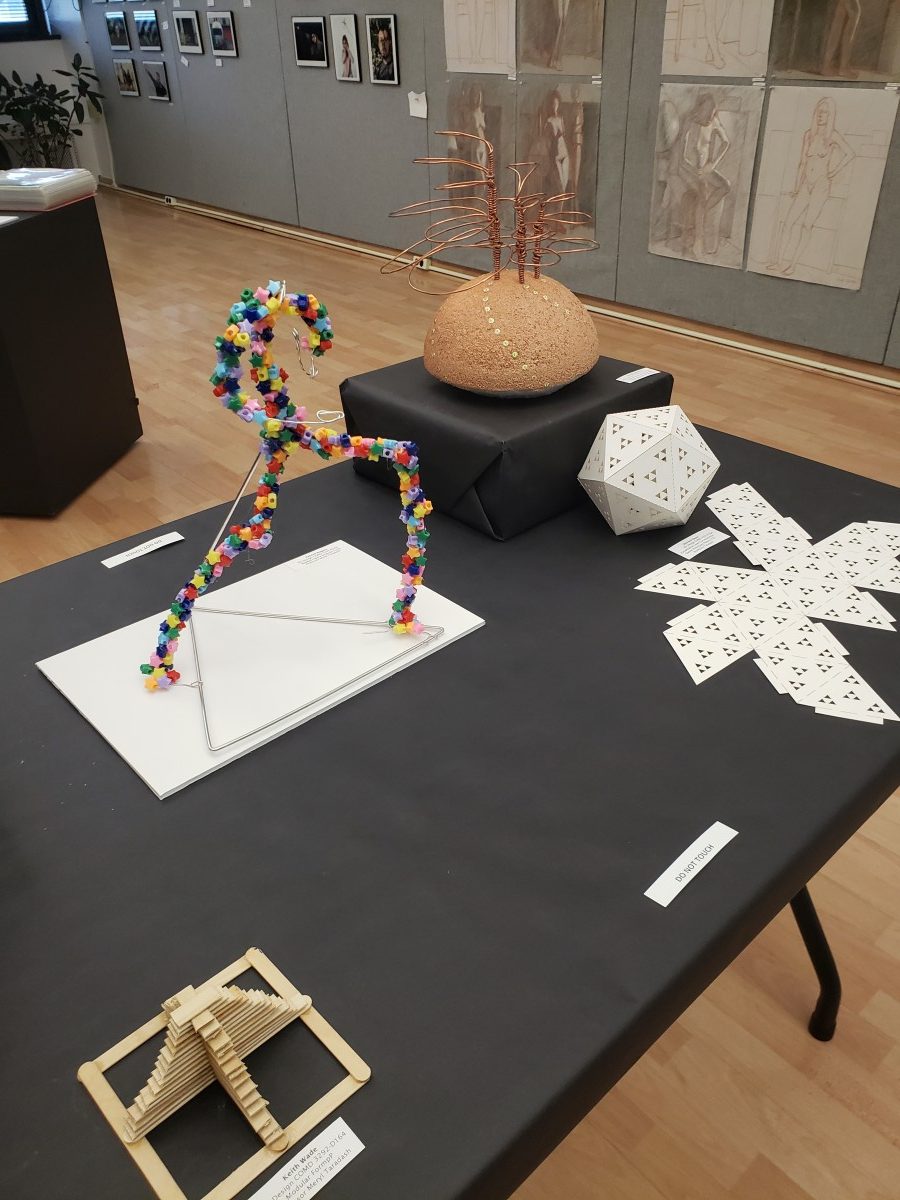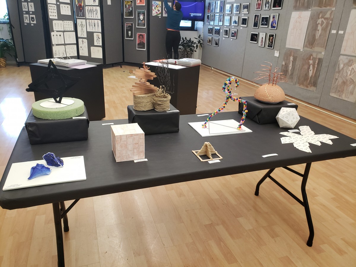
More Sculpture Biography notes
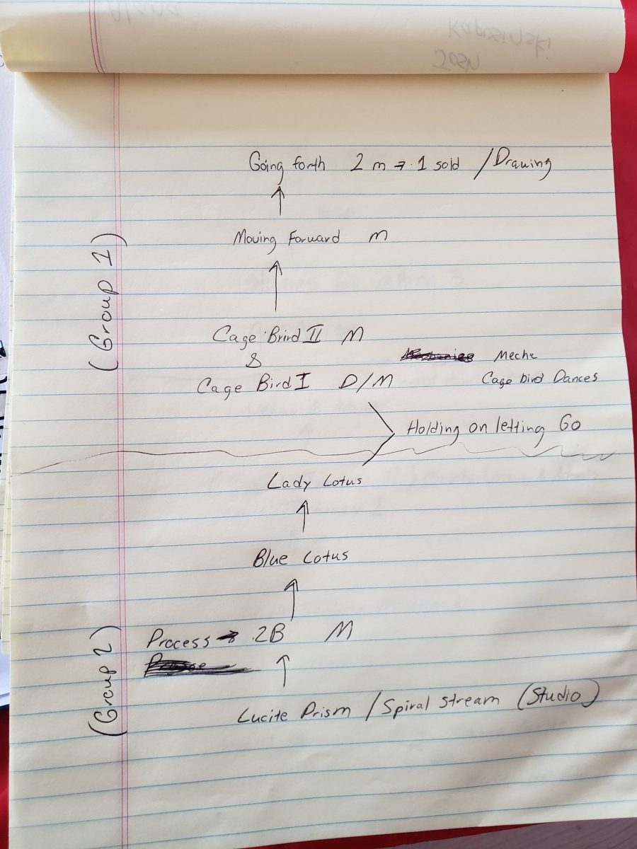
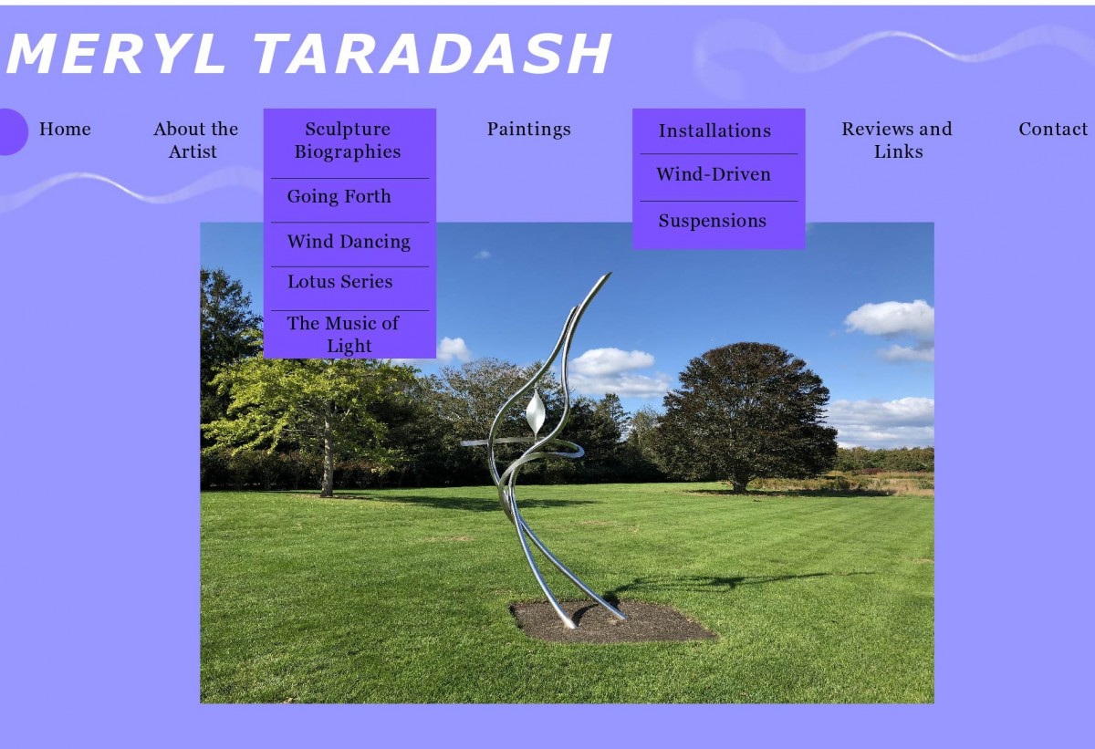
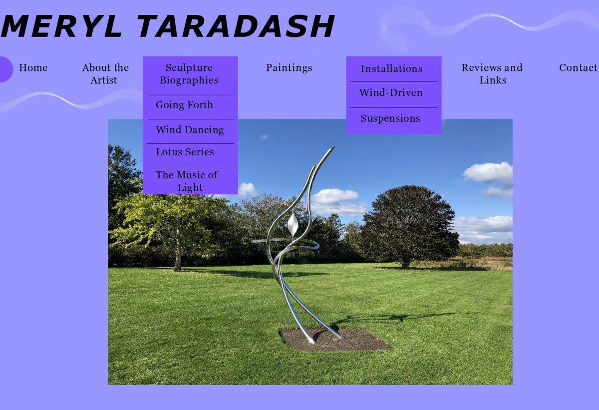
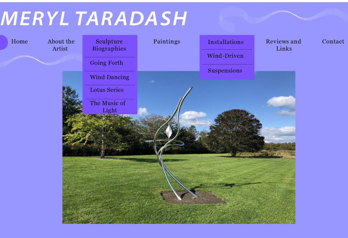
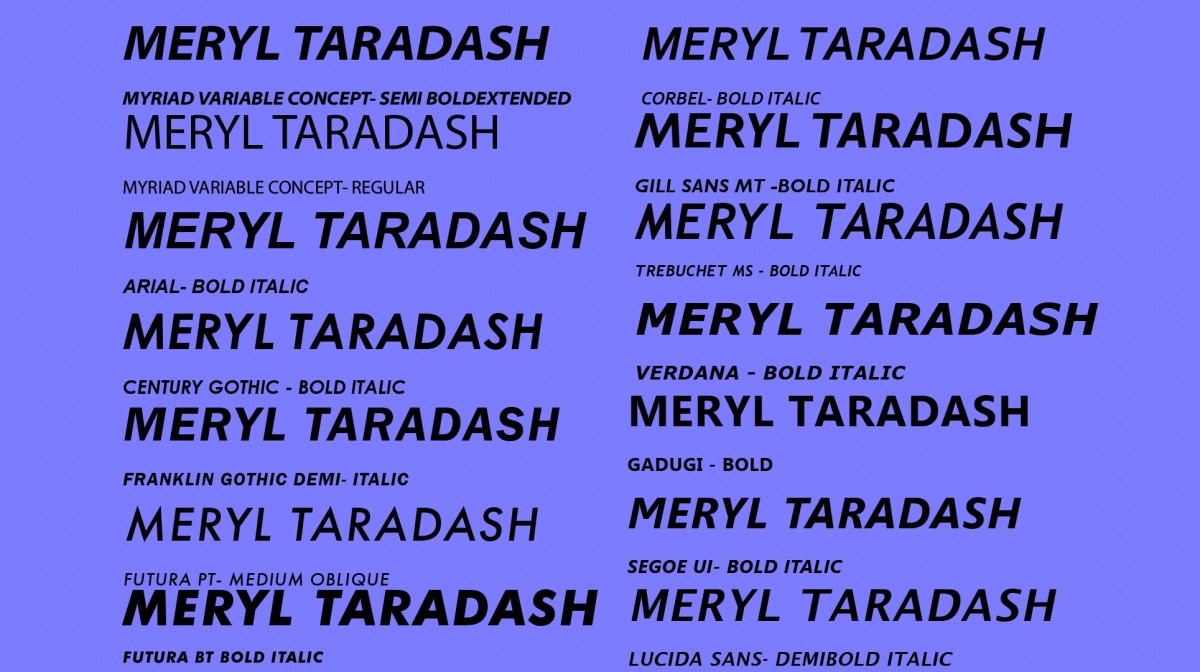
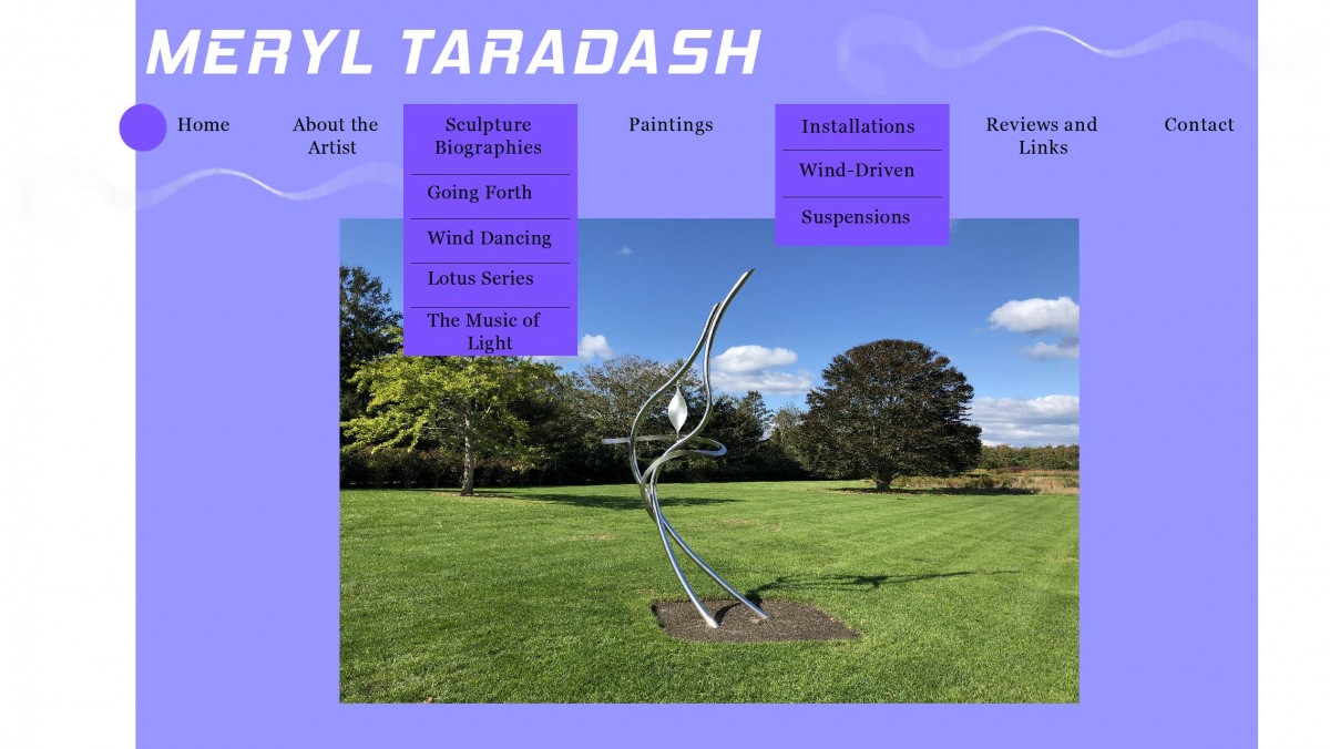
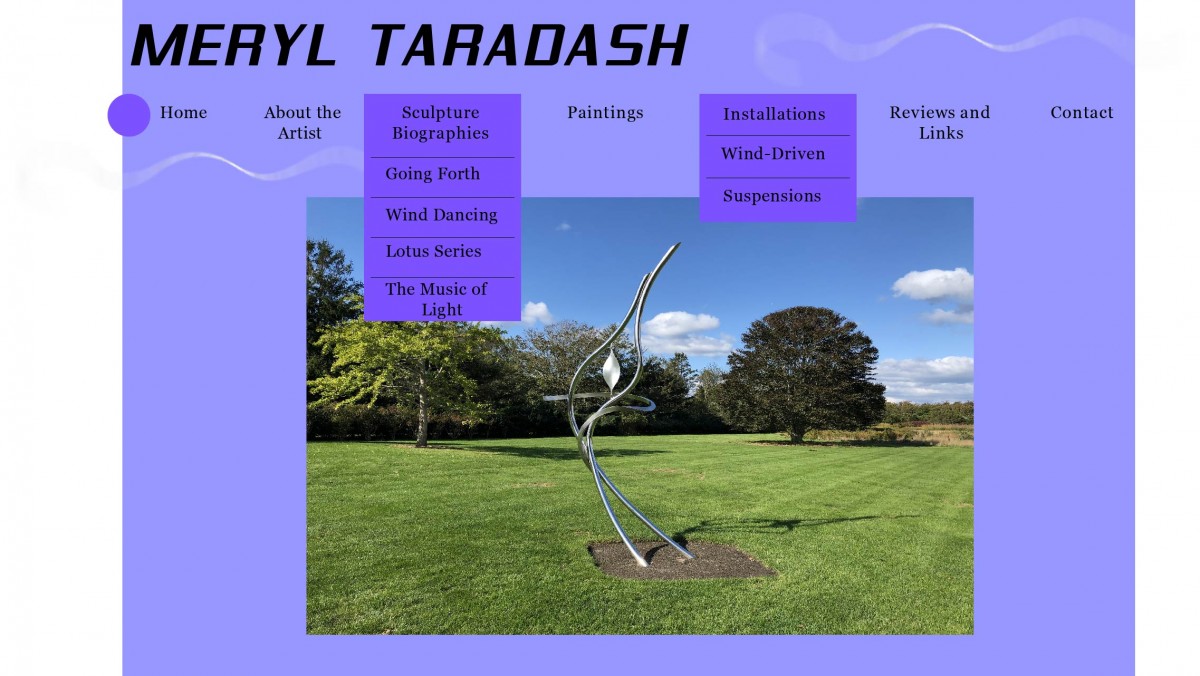
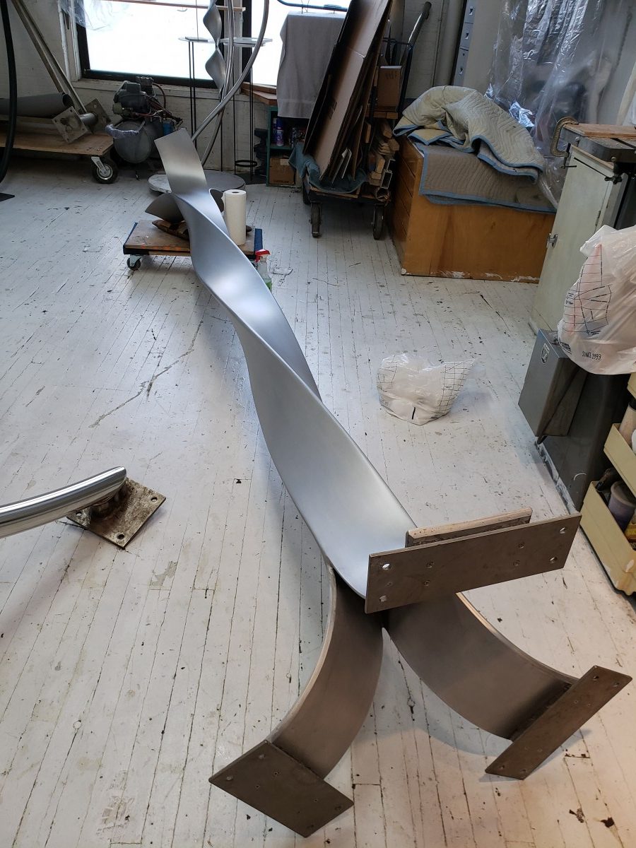
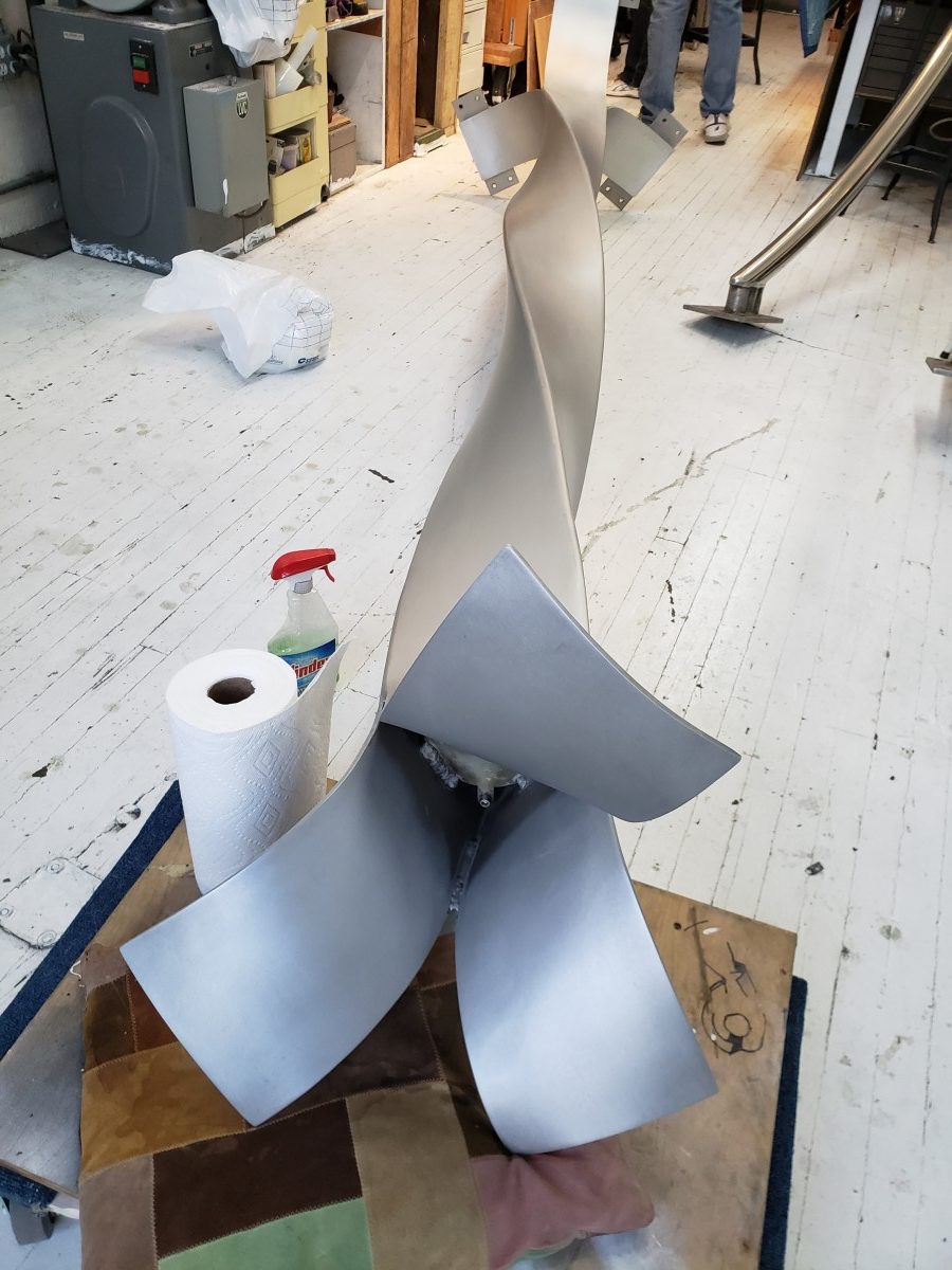
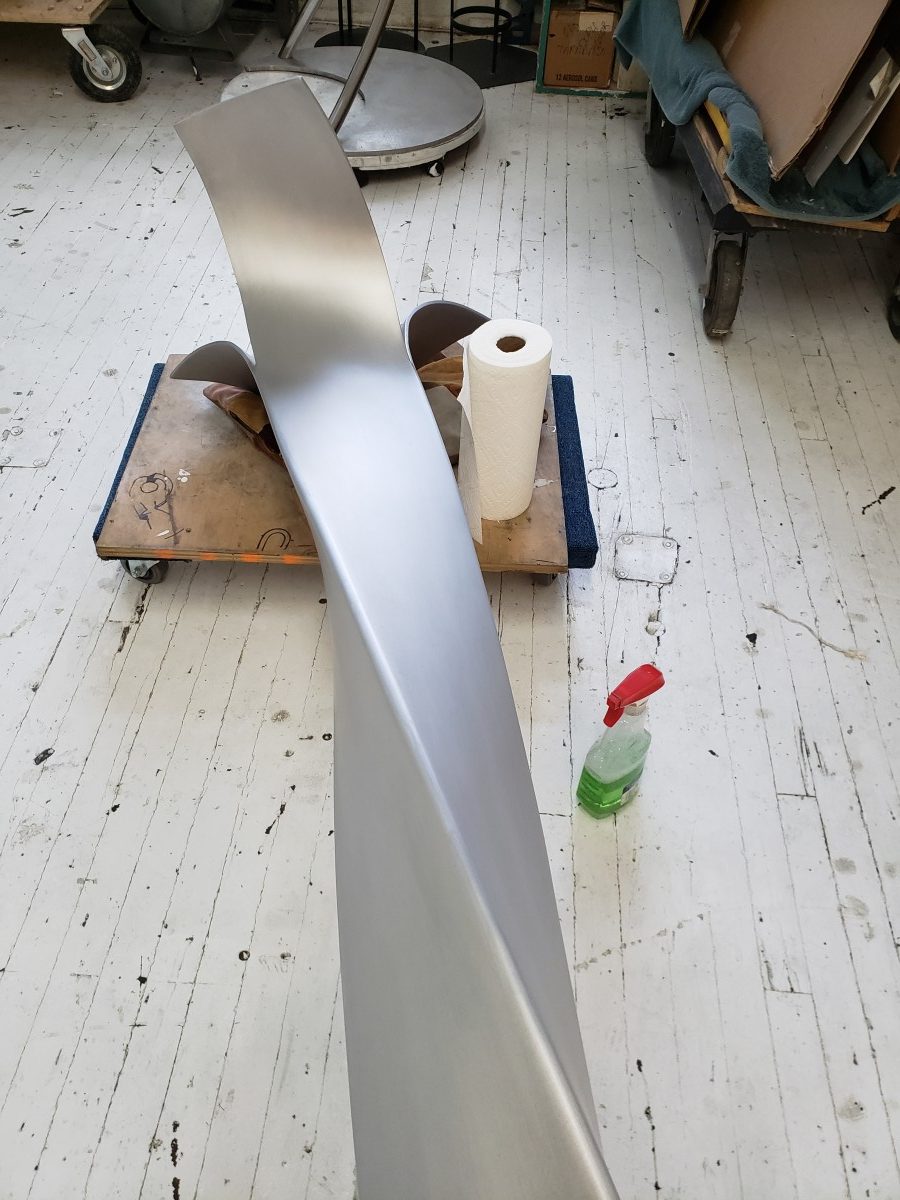
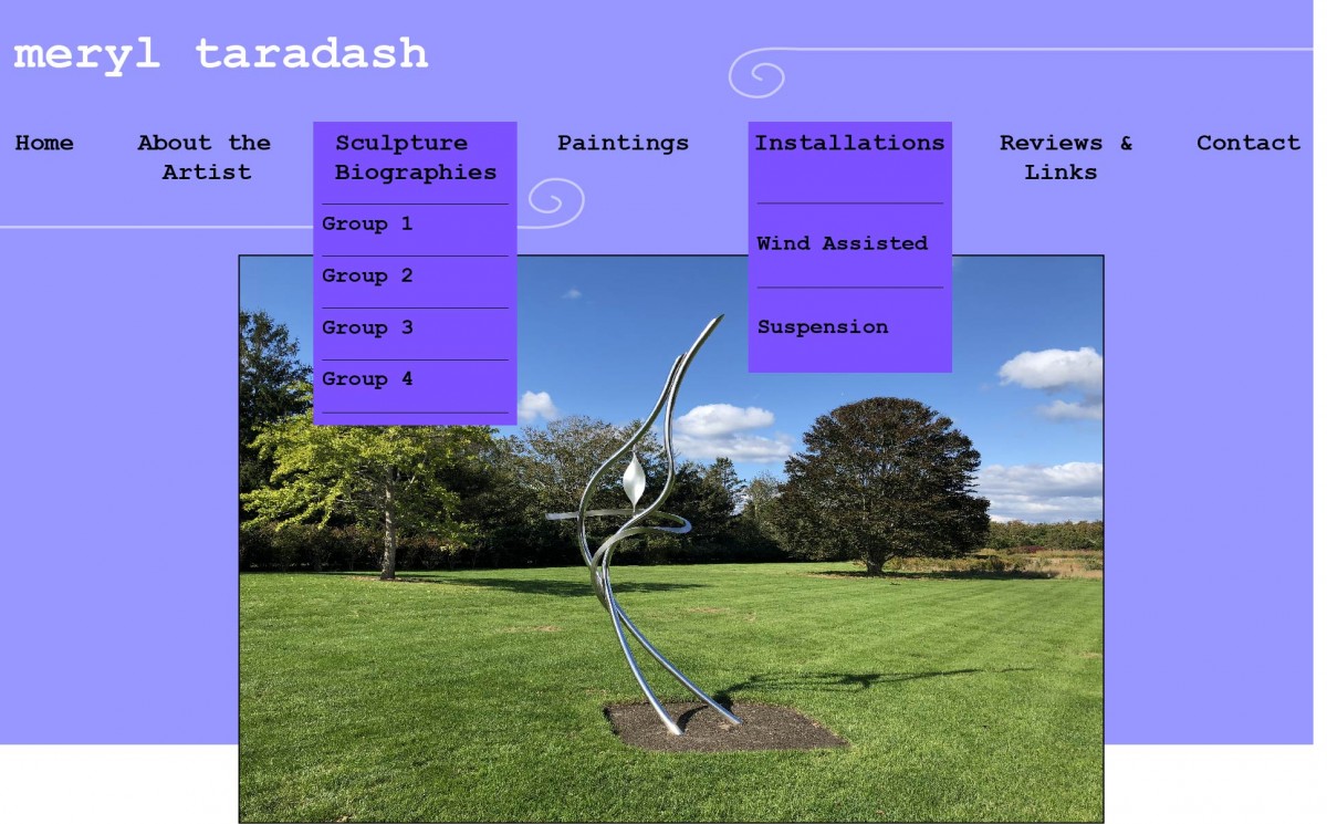
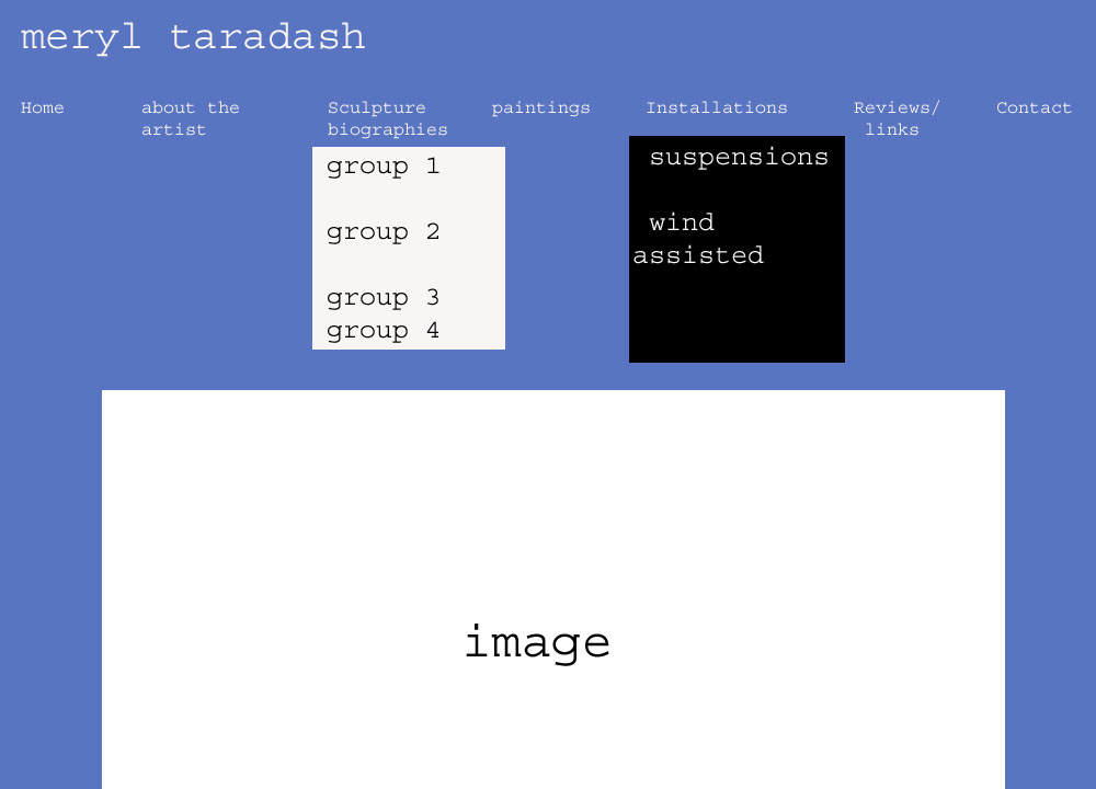
As the semester soon comes to a close, the Professor and I are trying to get our last bits of work together before my official time as her intern ends. So today we were getting together more of the information and pictures that we need for the sculpture biographies for the website. I took the critiques that the professor had for me regarding the Lady Lotus and Going Forth Biographies and applied them to create revised versions of the webpages. I was understanding what the professor was saying last week about trying to not rely on text and there can be too much text on the page. Being more of a visual person myself I can relate to wanting to have the images speak more for themselves rather than relying on text. So I took out the titles of the series and just left it at ‘Sculpture Biographies’ at the top. I also replaced some of the pictures to clearer images of some of the sculptures that the professor provided for me. I was also able to start working on the Sculpture Biography for ‘The Music of Light’ series; but could not finish it since I was still missing some pictures and information for it.
The Professor and I met up to go over everything that I had worked on over the Thanksgiving break. So far she is liking what she was seeing regarding me applying the critiques to the webpages. However she was thinking about it more and she thinks that maybe we should remove the word ‘Sculpture Biographies’ of the pages entirely. Which at first I was a little hesitant about taking it off the pages then I realized and understood that maybe the viewer of the site will understand that we are trying to promote the pictures and show the pictures off more rather than rely on so much direction from text. We also discussed more about what more we need to create the sculpture bios for ‘The Music of Light’ and the ‘Wind Dancing’ series. The Professor and I will meet again next week and will send me more pictures and information to create those sculpture bios.
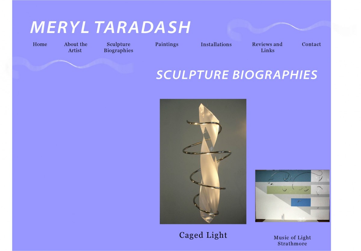
Sculpture Biography for ‘The Music of Light’

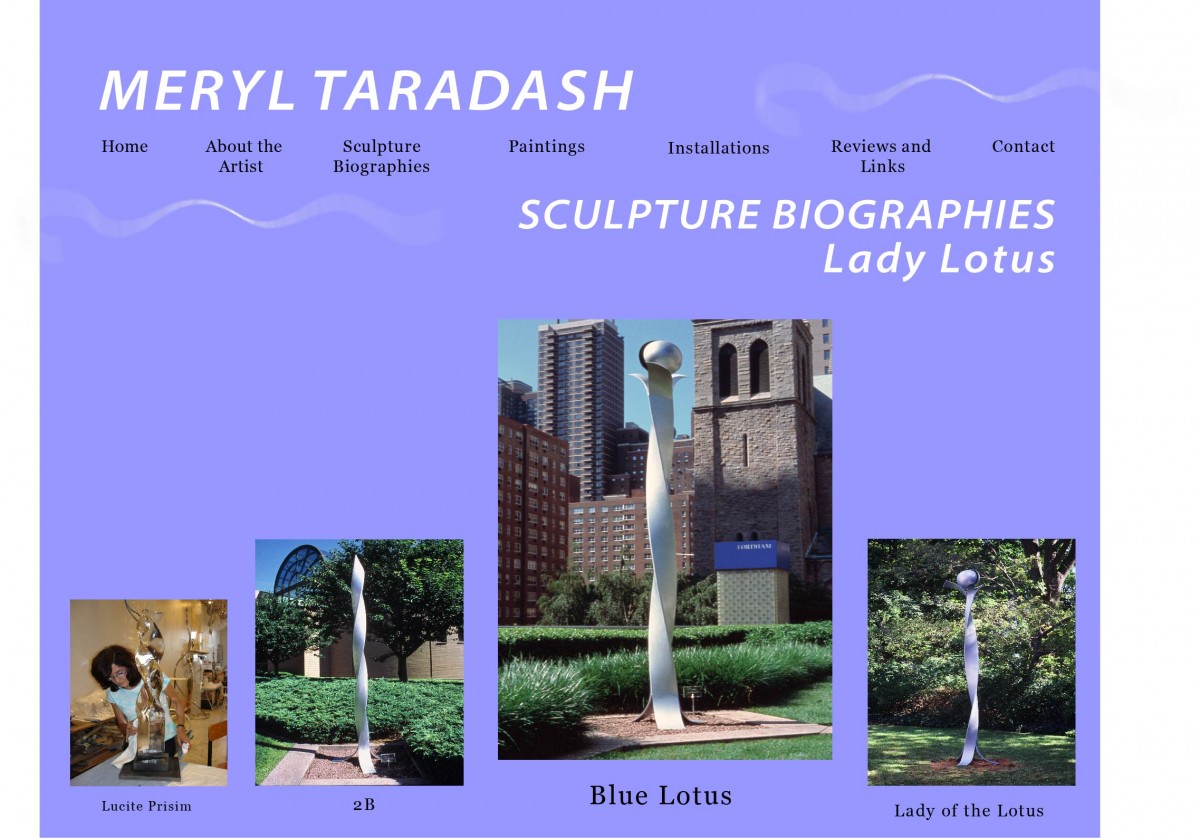
Revised Sculpture Biography for ‘Lady Lotus’ series
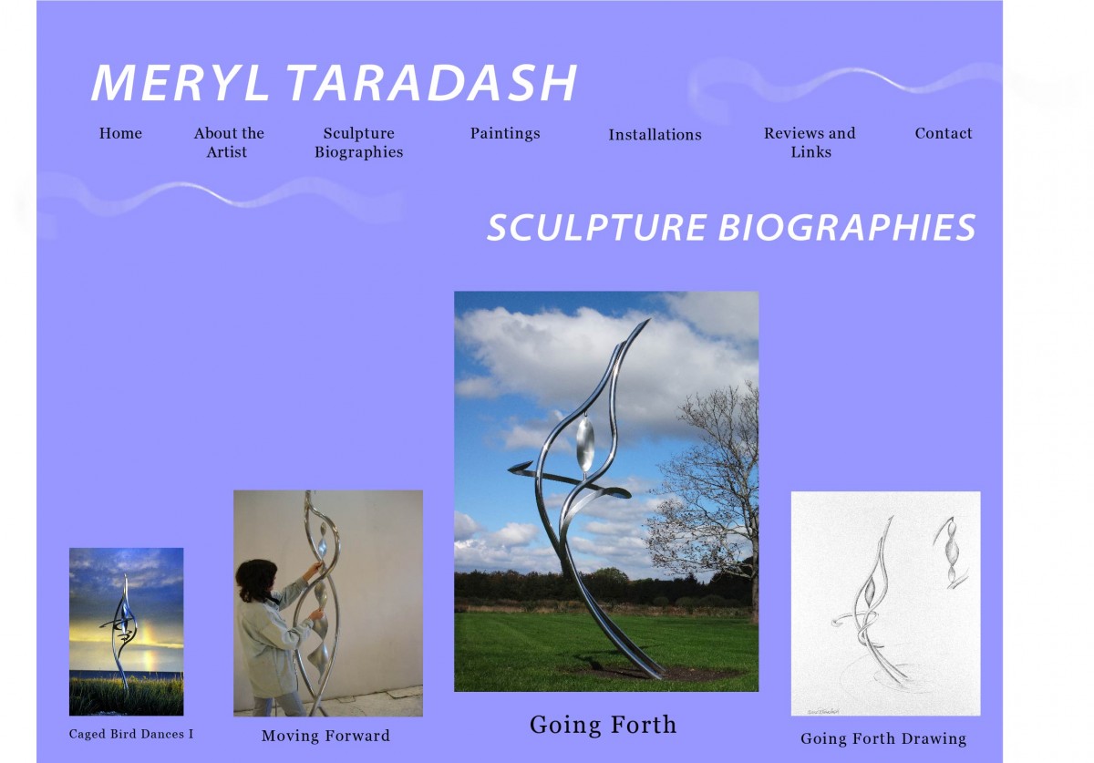
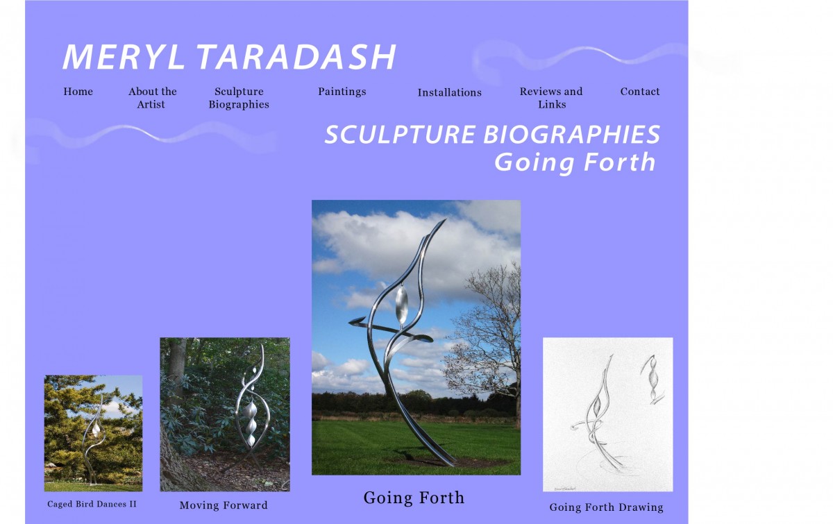
Revised Sculpture Biography for ‘Going Forth’ process