Anmol K ePortfolio

Enthusiastic and Determined

Journal Entry Five

Types of an interview and what to do before, during and after an interview.

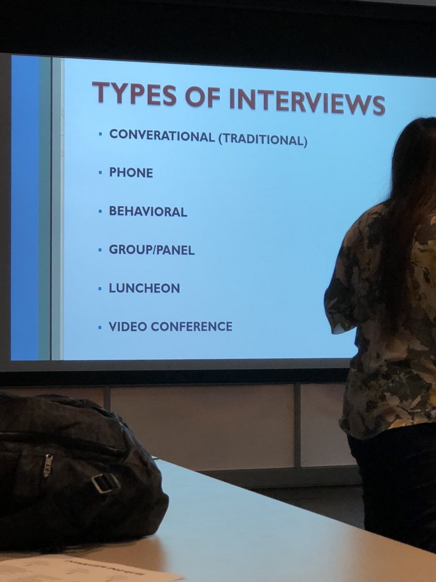
Recently, I went to a networking event on campus. It was a PDC event on what to do before the interview, during, after the interview. It was interesting to know what can you do to improve yourself. I got to know what types of interview are being held in today’s time. There are 6 of them which are conversational, phone, behavioral, group, luncheon, and video conference.  We had slides which show us what to expect in an interview of each topic. In conversational you have to show your interest and your attitude has to stand out. In a phone interview you are expressionless so basically you have to show expression through words. Doing all the company’s research saves you on their list of options. In a behavioral interview, you literally have to describe what you can handle real work situations. In a group interview, you have to be at your best and aware that other people can qualify. In a luncheon interview, you have to be aware and behave appropriately because you are in the social environment. Lastly, the video interview is quite in today and it allows a digital access to see the person basically face to face. Before the interview, you have to know everything about the company which doesn’t lack research. I need to have a purpose to give an interview and tell the company what and where you do you think you stand. Practicing your skills and having an eye contact is really important. During the interview wear appropriate clothes and give a firm handshake. Answering questions without being nervous and be enthusiastic. Exchange business cards are extra skills so later on if you don’t select then still you are satisfied with the interview.  After the interview, send a thank you note and evaluate yourself how did you do and try to get something positive out of this interview.

Journal Entry One

The company that I do internship is New York Early Childhood Professional Development Institute which is located on 16 Court Street in Brooklyn. There are many departments in this company and I work as design intern in Informal Family Child Care Project. It is a private-public company because we work with child care providers. We have events on saturday on different topic to them with taking care of the child. We have books and supllies as raffles.

I make design flyers for them month for the upcoming workshops and events. The company is founded in 2004 and the size is up 50 employers. They have career services department which helps eduactors find a job in their field. Through events they help people with their resumes and send them links of multiple job listing. On facebook the company as good reviews on Leadership initiative which talks about early care and education to what solution we can take out. We had one event which was on mindfulness that was successful event.

Anomaly Final Paper

Last week we went on a trip at the anomaly. My aha moment was when we were taking a tour of the building we were going up down like a puzzle. Every building we went to was very dark and everybody was just into their work. The tour of the building was fast but interesting also the way anomaly grew their space in the building. The interior design was pretty cool because it was not too much but limited design. They are 7-floor production and each floor is a different department.

The new terminology I have learned is when anomaly hires new people they have essay questions which are quirky and it could be about anything. Anomaly wants talented personality which stands out. They have multiple essay question which interesting because not a lot agency have that kind freedom of writing. Also, employees have this right to present an idea to the founder about anything. If the founder likes it they go ahead with it.

The new thing I learned which I didn’t know before the trip was that anomaly is film heavy production. If you are associated with anomaly for 5 years you get to travel for a month in different country and pitch that project of yours. Anomaly also doesn’t worry about competition and they just grow nonstop. They Thursday which called the drinking day.

I don’t really see myself working in an environment like an anomaly because I didn’t get much insight into the company. I did get how you get an interview but not what they have done creatively. They do have big clients but I would need more information. I didn’t get to see the passion and creativity because we didn’t get to see their projects.

Anomaly encouraged us to go to Networking Events and be on LinkedIn. Take the opportunity that comes your way. They work on 100s of the campaign and it’s a crazy amount of work. They had all their awards place in one place. Overall, I did enjoy the trip but they had pitch and everything so we had no presentation. But at least we learned something by going there.

Summary

Anmol Kaur
Professor Frank Adae
February 28, 2016
                        Graphic Communication has categories of prepress, press, postpress. These three have their own way of describing communication. Not only drawing but having special skills in computer and being able to create creative work. Design Reproduction is an example that manipulated many ways. It makes graphic designer life easier because it focuses on aesthetic and creativity that makes the person’s attention on design rather than technology. Macintosh controls the graphic arts industry. It is important to understand the principle of design and technology. Printing and imaging have grown all the years and has done amazing works in all field. Packaging graphic is part of the graphic arts and it is the fastest growing industry. Back in the 1456, Gutenberg made mass production of printing possible. In 1970, change was the main part of printing industry. Invention of writing appeared in 4500 B.C and 3500 B.C. Ts’ai discovered how to make “paper” with pulp mixture of mulberry bark. Papyrus and paper came during 1085 B.C. Papyrus grew along the Nile River created smooth surface to write and draw. By 1500 more than 20 million books were print. Gutenberg printed Bible and in the west over 500 books paper existed 2,000 years. Professionals Manuscripts writing became an industry during the Dark Ages. Peter Ramus introduced the concept of print-oriented books to all the students. The book was the first “teaching machine” and the first mass-production produced. Nicolas Janson, the famous Italian printer perfected the clarity, beauty, and utility of the roman typeface. Lithographic solved many problems related to metal type, woodcuts, and copperplate. They were made from porous Bavarian limestone where images would go. It was the most economical way reproduce illustration and lithographic was the most popular. It is still popular today and highly sophisticated printing presses. Early newspaper was called Boston News-letter published in 1704. A lot of publication developed in 1800s to mid 1900s. Also Charles Mahon had method of printing stereotype from plaster molds. The Linotype Machine is one of the greatest inventions of all time. This was made by Ottamar Megenthaler who was German immigrant. Many books and newspaper were produced by this Linotype machine. The art of typography was developed and many typography is type and type design. After this many technologies were produced. Lases, microwave relays, and cable communication etc. Computers and the desktop were the innovation improved the printing industry. Chesley Carlson invented a process of printing plant. Xerography has become “on- demand” and became important to everyone. Graphic Communication came a long way and made many innovations.

Field Trip

Anmol Kaur
April 28, 2016
Professor Frank Adae
                                                                        Field Trip
            Society of Illustrators was an experience to learn more about art and specially illustrator. Many art work was shown from the early years. There was a red wall where everything famous work is hanged to be talked about. There was harry potter poster painted so cleanly. Many president’s pictures were hanged on the wall as you go upstairs. It was delight experience to know about art and the place.
            On one floor, they had a café and Rick’s work hanged around the walls to look at. They change it after 6 weeks, so it doesn’t get boring. They have place for people to sit and talk about artwork and have a good time. Top floor was all about artwork that are still so famous today and talking about the work and how it is done. All floors had different works of illustration, posters and paintings. Many works had a story to tell about the time it was made in. They had shop where you can buy all of things related to artwork.
            They also had basement where artwork was there too. A lot of rare art and very explicit work they had. The illustration work was from the 1800s and many have funny illustrations. It was an experience that I never had of illustration. The building itself is very old and holds a lot of importance to the artwork. They keep a contest where they choose student according to the work that they submit.

Pattern/Transparency

anmol pttrntrnsp2

In this project, I had to make big square of 4×4 inches. The checkered grid has square of 1×1 inches. The squares have pattern of two muted colors. To create blobs firstly on the sketch paper I had to use ink with brushes to create blobs and see how the brushes are reacting. I had to decide the patterns if they will be opaque and transparent. I chose Ultramarine Blue to be muted for transparency and opaque to be muted for red. For accents, I chose triangles and squares to create a focus. For the color blobs, there had to be color distribution which appeared three times because there are 12 blobs in total.

For the blobs to land up on the checkered was the most confusing part. First, I had to position the blobs originally and from there flip the tracing horizontally. For the 90 degree rotation (right) I had to rotate from the original. For the flopped, I had to flip the tracing paper vertically. My color choices were chosen according to the background. I used tints and secondary colors for the blobs. I didn’t choose dark colors because looking at the background it will empower them. I really like how the transparency of green came out because it’s jumping in and out. One of the students commented that it’s creating spacial effect. The only thing I am not sure of is how the orange opaque and it’s transparency is working and I feel it’s the weakest of all. I was satisfied with tint blue, tone pink, and tint of yellow. Overall, I did good work and made good choices leaving the orange out.


Transparency and Composition Project

anmol trnsp2

Transparency Project

In this project of transparency, I had to select 3 shapes with 2 layers and 3 shapes with 3 layers of overlapping transparency. My main concern for this project particular was that I ran out of yellow paint and I didn’t know how to manage. There was no time to get yellow for somewhere. Therefore, my choices of color became limited. I had Cadmium Red, Primary Blue, Ultramarine Blue, White, and Ivory Black. I also had to use 2 tints, 2 tones and one shade, along with that primary, secondary, and tertiary colors. So having the color choices, it came out pretty decent which created warmth. I took it as challenge that it might work and  I was not sure how it will come out. But when I presented to the class everyone was very amazed or curious about how did I put it all together. People had questions about how did I manage without yellow. I told them it was a different experience with limited amount of choices. In addition to that I was happy with my work and it did interest students in class because it was done with limited choices of color.

My color collection just started out with picking tint of red. This color seeks a lot of attention and I decided to use this color on the small circles. If you look at the image and small circles it makes your eye move point to point in the composition which is difficult for the 3 layers of overlapping transparency. Especially the square, triangle, and strip which I worked on first. I managed to get the right color between the three colors. The same situation occurred with big circle, wavy line and a strip could have been more transparent. For the two layers transparency, the curve and circle overlapping could’ve been a bit more convincing in terms of transparency as well. Also, the big circle and wavy line overlapping worked really good. The square and small circle had the transparency. Overall, I did decent work on transparency and composing.


Texture & Graphic

Texture & Graphic

In this project, texture to graphic was extremely interesting. What I really like about this project is that textures of any kind can turn into graphics. It creates an illusion in your mind. We needed 20 rubbings of texture that turn into graphics. In order to create figure/ground, we had make plan of 50/50 black and white. That each unit was mounted down and traced the shapes of texture. At the end it surprises because it’s not planned how it is going to come out.

For the 50/50 plan, I had to shade areas black and white. The shaded area for each unit, I chose white background and black shapes. The white area for each unit is black background and white shapes. After deciding the 50/50 plan, I traced the shapes of texture in each unit mounted down. Not only this then flipped the tracing paper over to trace the shapes from the back. On the right, trace the composition down from tracing paper with 4h pencil. After all of this, apply the 50/50 plan for shapes and background for each unit with the sharpies. I followed the plans for 50/50 clearly. When I presented to the class, I had a comment on it that it represents day and night. I was very happy with my project because it’s something that you don’t know how it is going to come out. That was the most curious part of it.

Welcome!

This is the first post on your Learning Blog. Edit or delete it, then start blogging!

The ePortfolio is both a Learning Blog and an Academic Career Portfolio. Use the Learning Blog to document your learning experiences and class assignments each semester. As time goes by, add content to the Academics and Career sections to show your department, graduate institutions, or future employers how well prepared you are for your chosen career.

NOTE: Remember to add appropriate Categories and Tags to your posts. This will help your professors and other visitors find the content they are looking for. The Categories “Coursework” and “Field Trips” and the Tags “OpenLab” and “City Tech” have already been applied to this post. Feel free to make changes!

© 2024 Anmol K ePortfolio

Theme by Anders NorenUp ↑