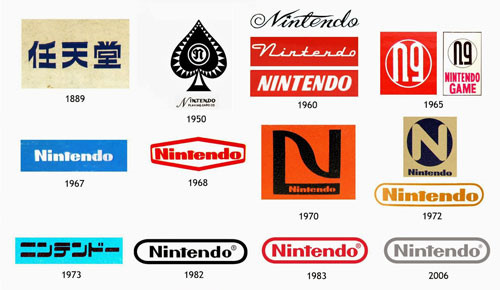
The history of Nintendo goes all the way back to 1889. Originally named “Nintendo Koppai”.
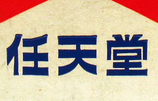
Nintendo is a Japanese games giant that rules the video gaming industry since the last four decades. It was founded in 1889 by Fusajiro Yamuschi. Today, the company stands as Japan’s third most valuable company with an astonishing market share. Fast-forward to 1953, the company was being run by Fusajiro’s grandson, Hiroshi Yamauchi and had become the first to produce plastic playing cards in Japan, however, it transformed itself into a handheld video games manufacturer. The company also manufactures toys and popular electronic games. This was the first Nintendo logo, and it is the combination of three different Japanese sounds (任 (Nin) 天 (ten) 堂 (dō)) that form the initial sound of Nintendo. Nintendo is actually pronounced the same in Japanese as it is in any other language. The company kept this logo for many years while they were selling the cards in Japan.
 The “Ace of Spades” logo, which was used in 1950–1960, reflects the fact that at that time Nintendo was a manufacturer of playing cards. In 1960–1965 several “handwritten” wordmarks were used, which were later replaced by a more legible logo given in a clear sans-serif type. At the same period, one more insignia was used, which looks very similar to the current one. Throughout the following decades there was some playing around with shapes, colors, and types.
This initiative proved to be immensely popular and resulted in Nintendo dominating the industry. After a trip to the US in 1956, Hiroshi began rethinking the long term viability of the playing card business. He met with the largest card manufacturer in the country and was shocked by their small offices. He came to the conclusion that the business was far too limited. 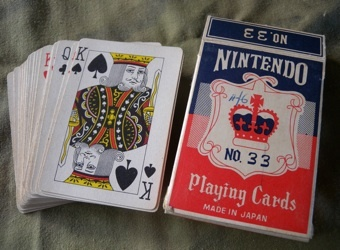

Innovation came in the form of Disney in 1959. Nintendo struck a deal where they were able to print Disney characters on their cards. This enabled the business to tap into an entirely new market. Up until this point, playing cards were regarded almost exclusively as a device for gambling. With the new, much younger, target audience, Nintendo created books that explained new games that could be played with these cards. 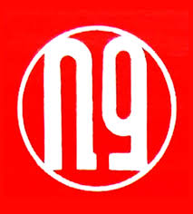
The tie in was hugely successful and over 600,000 packs were sold in the first year alone. In addition, the success of the new venture resulted in the company deciding to go public in 1962. A sample of these ventures include: a taxi company; shortly stay hotel chain, an instant rice food company, Chiritorie vacuum cleaners; and toy making, among others; But pretty much all of these ventures went nowhere.
Unfortunately for Nintendo, it was around this time that the playing card business reached its saturation point, Japanese households stopped buying them and Nintendo’s stock fell from 900 to 60 Yen. However, in 1965, the company hired a new maintenance engineer for their assembly line. His name was Gunpei Yokoi and helped turn Nintendo’s luck around. In 1970, Hiroshi noticed Gunpei Yokoi playing with an extending arm that he had made. Deciding to take a gamble, Hiroshi requested Gunpei develop his arm as a proper product that was released for Christmas.

Selling over a million units, the Ultra Hand was an instant hit and earned Gunpei a position in product development. He was highly successful and with his engineering background was able to develop many more lucrative electronic toys for Nintendo. This was significant, because they were one of the only companies that developed such toys at the time. They were able to charge higher price and earn a greater profit margin.

It was around that time that the company began to take an interest in the popularity of video games. After their success, they decided to develop their own games for the home and arcades. Their first was released in 1975 and was called EVR Race. It was closely followed by Donkey Kong. The hugely successful ape-centric game was the brainchild of Shigeru Miyamoto, a rising rock star in the gaming industry. It was released in Atari 2600, Intellivision and ColecoVision. Then the company began experimenting with hand held video games such as the Game & Watch- a predecessor to the Game Boy. This is the logo that Nintendo used while developing some of its first video games systems. This logo was far easier to recognize than many of the previous logos, and the classic styling that was invented in this logo that follow would still be the standard fpr the logos that would be developed after it.
Despite the hi-fi nature of Nintendo Co., the company sports a simple but attractive logo design that instantly brings the company’s illustrious creations to mind. Nintendo has used this logo ever since it entered the world of video gaming products.
The company’s plain logo design compliments Nintendo’s image among its rivals as well as its millions of followers. The pundits reckon the secret behind Nintendo’s success is its use of an expressive logo that is both intelligent and precise, just like its video games.
In 2016 the wordmark adopted a new color scheme. In fact, it is again the combination of red and white, like in the 1975 logo, but this time the colors are reversed. Some designers are sure that the company had the intention of making a connection with the branding of the Nintendo Switch.
The Nintendo logo is placed in a round-rectangle with the logo appearing in a simple but bold manner. The only color used by the Nintendo logo is red because of its high visibility and attraction factors. The Nintendo logo employs a clear cut typeface which is good looking and catchy. The use of bold fonts lends it tremendous prominence and credibility. The Nintendo logo stands out from the rest thanks to the use of the simple typeface font. 
Sources: 1. https://www.famouslogos.us/nintendo-logo/
2. https://gizmodo.com/the-surprisingly-long-history-of-nintendo-1354286257
3. https://www.logaster.com/blog/nintendo-logo/
4. http://1000logos.net/nintendo-logo/